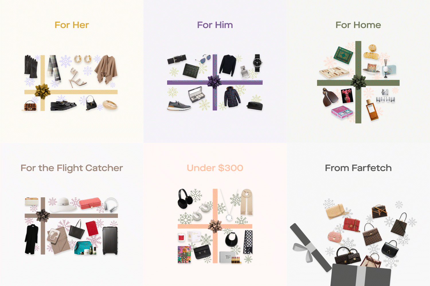
Appreciate Rebranding Project

During the rebranding project for Appreciate, we realized that the existing brand did not accurately represent the company's values and mission. Thus, we initiated a complete overhaul to better align the brand with the company's objectives. To guide our efforts, we asked ourselves critical questions about Appreciate's purpose, perception, and positioning in the luxury goods industry within the Web3 space.
Process
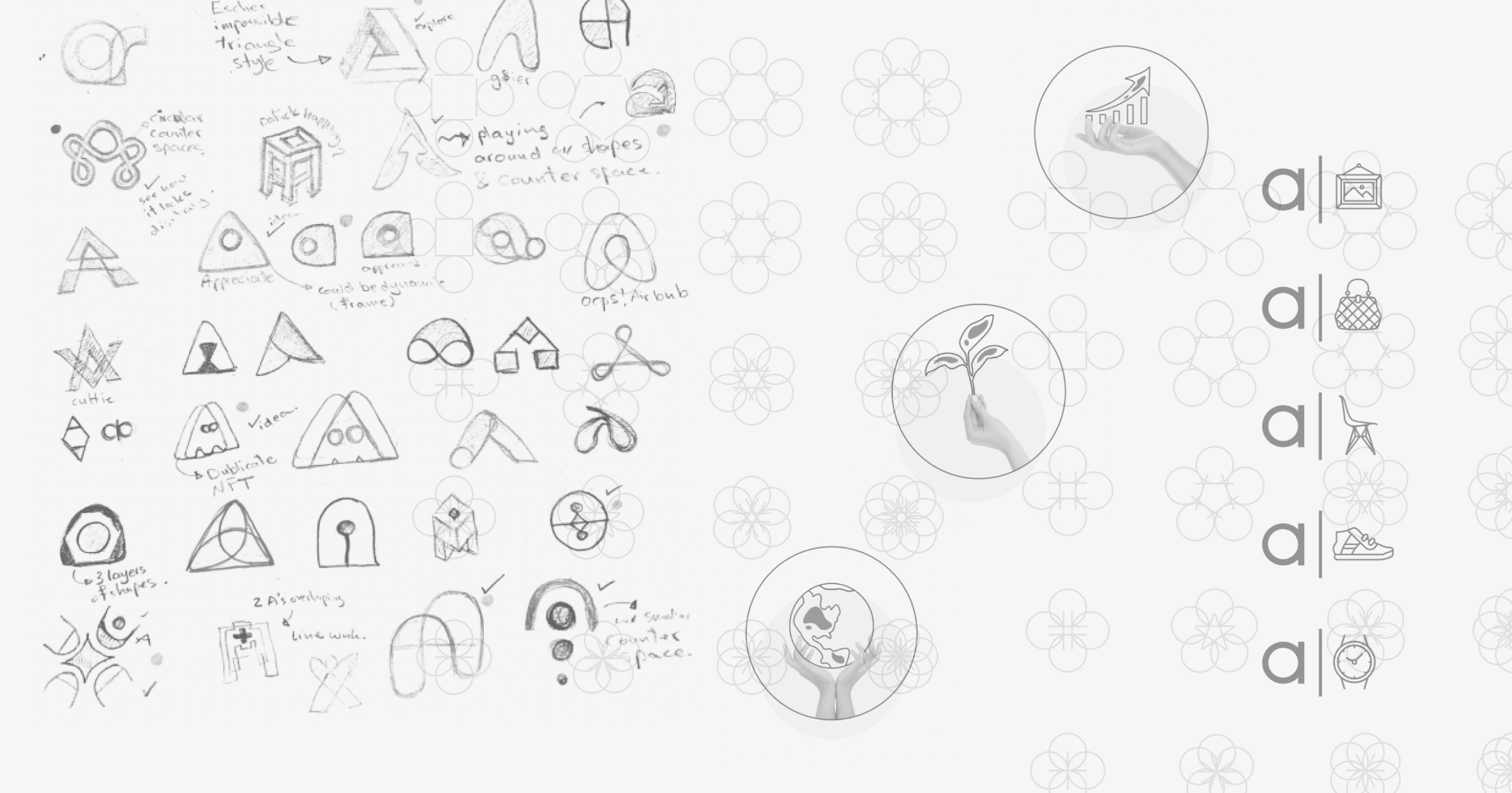
︎︎We approached the rebranding with a comprehensive design process, beginning with ideation and conceptualization, followed by several rounds of brainstorming, sketching, and multiple iterations, and culminating in the production of various assets for the new brand. We understood that Appreciate required a brand that effectively communicated its values and mission. As such, we focused on creating a brand that would accurately represent what Appreciate does and stands for. The rebranding process was a collaborative effort across the entire design team at Appreciate, resulting in a truly remarkable outcome.


Logo
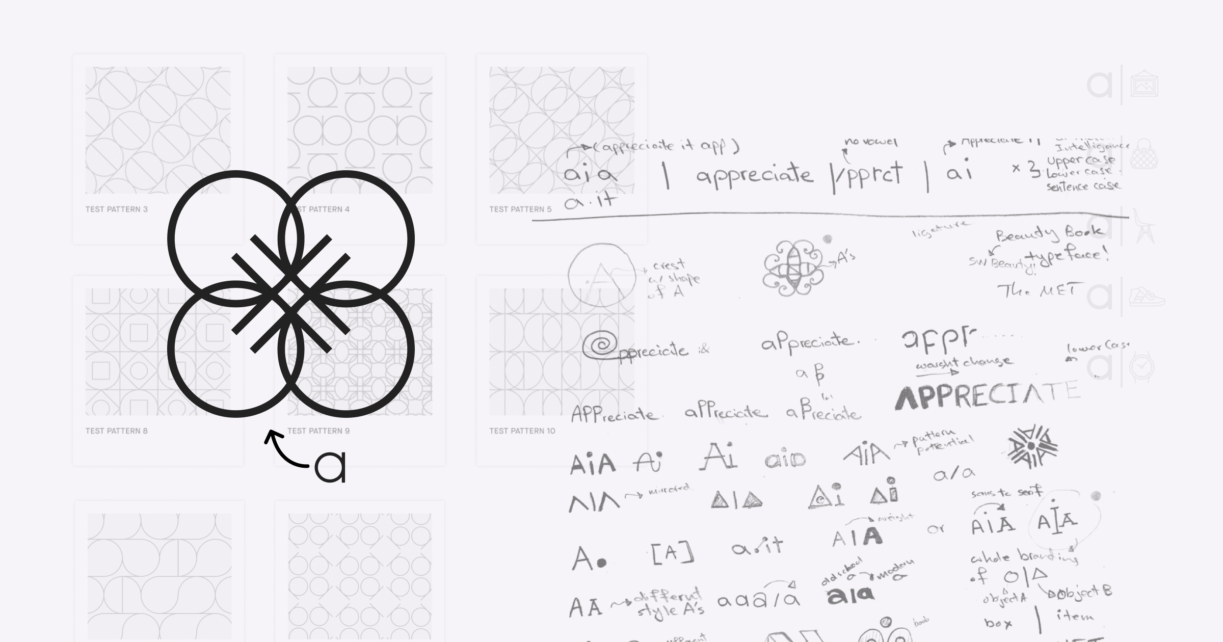
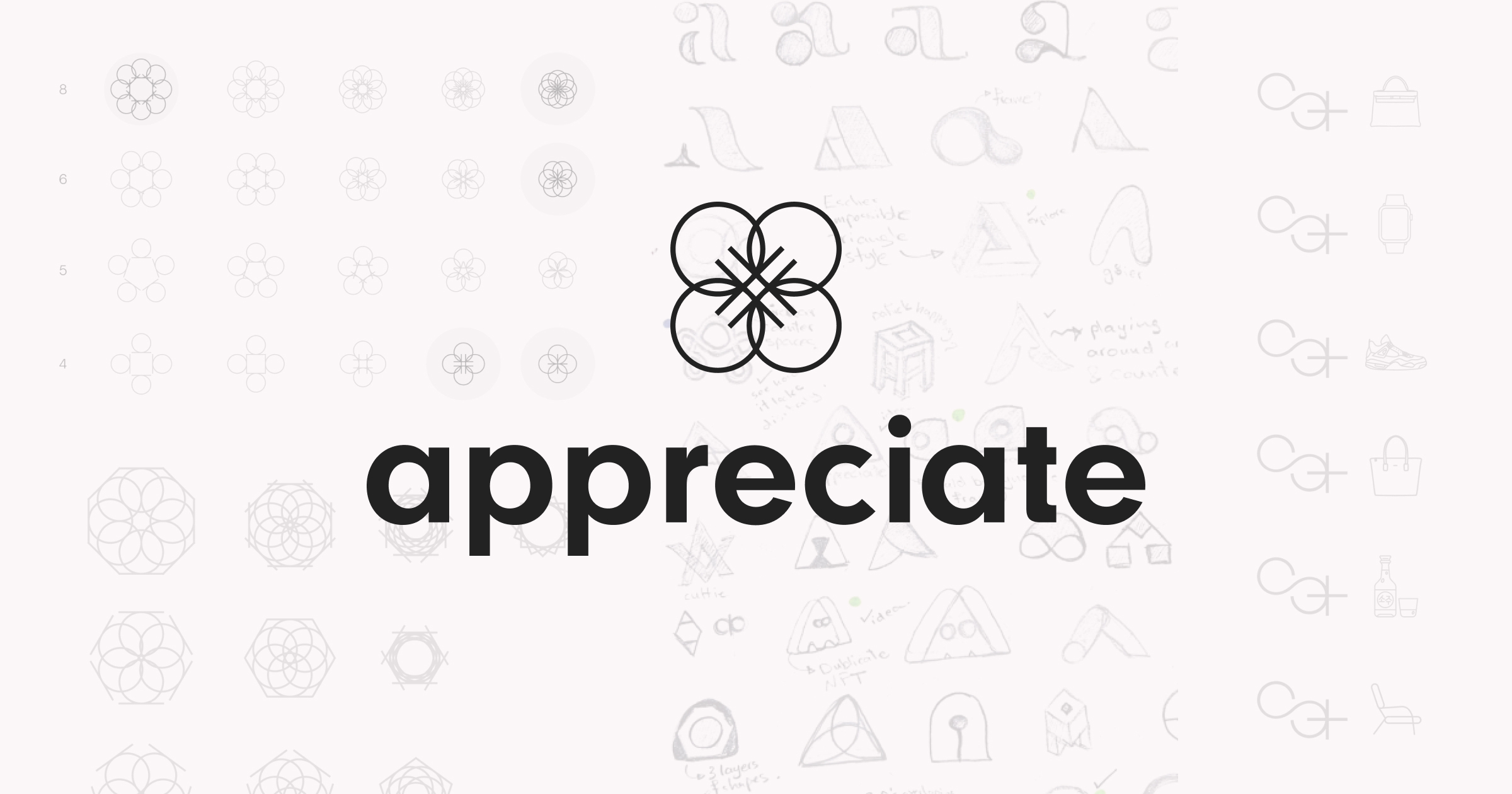
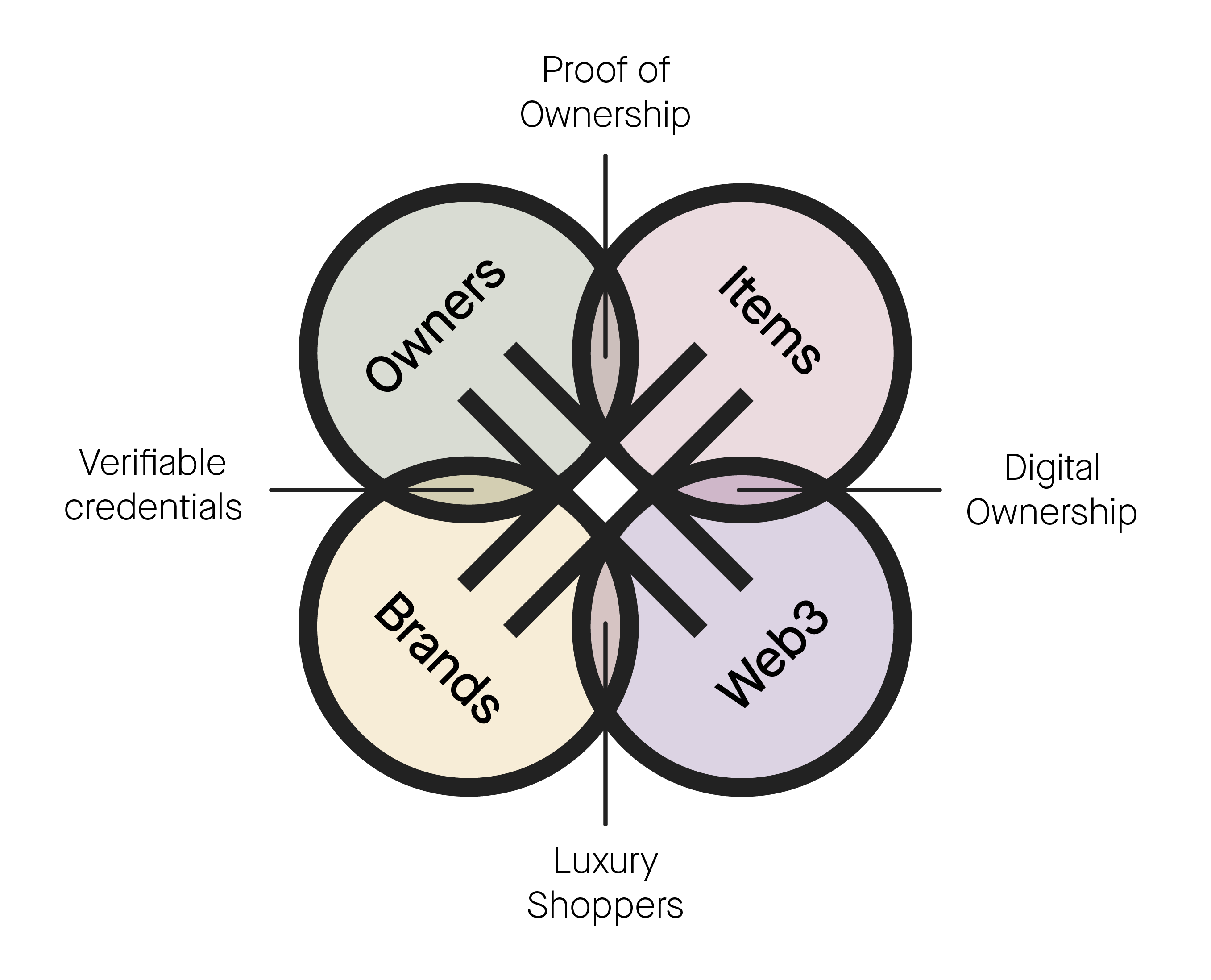
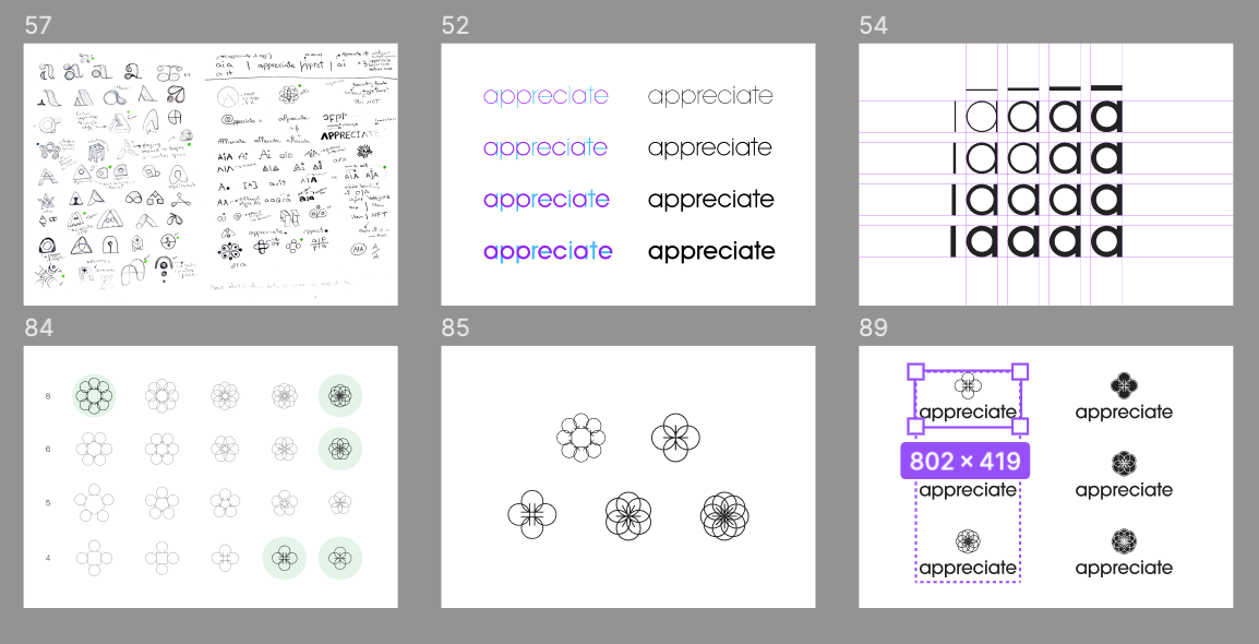
︎︎The number four holds a special significance in the new appreciate brand. The new logo features a clover made up of four intertwined a's, symbolizing the role of the appreciate platform in connecting brands, partners, owners, and luxury items.
Vertical and Horizontal Lockup
![]()
![]()
Light and Dark Backgrounds
![]()
![]()


Light and Dark Backgrounds
Type
︎︎To fit with the tech-focused aesthetic of appreciate, we sought out a clean and modern sans serif font with a touch of character. After exploring various options, we selected Maison Neue as our typeface of choice. This versatile font works exceptionally well in the digital space and adds a unique touch to the overall brand identity.
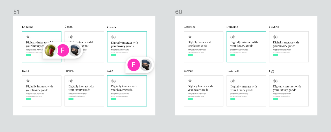
Type System
![]()
![]()
![Thank you Rob for our Kestrel System]()
![]()


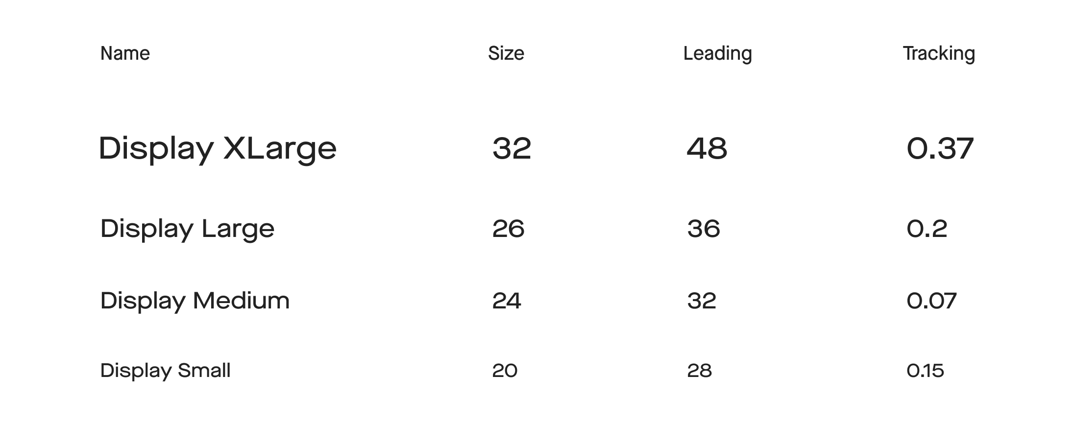
Color Palette
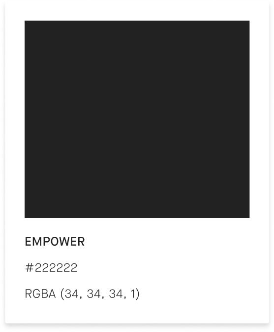
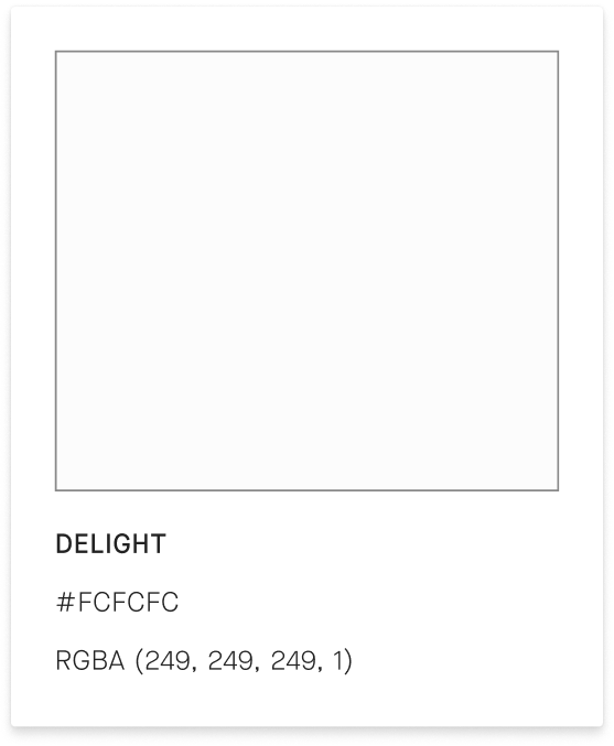
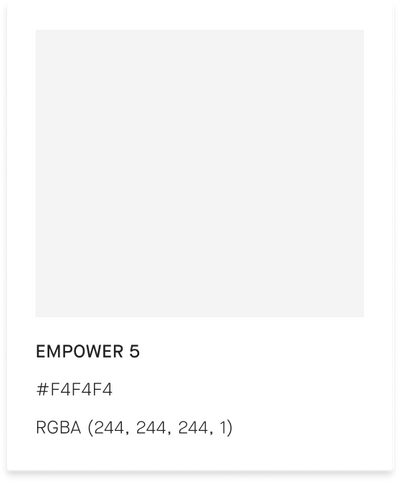
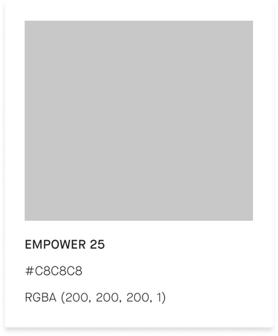
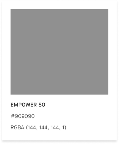
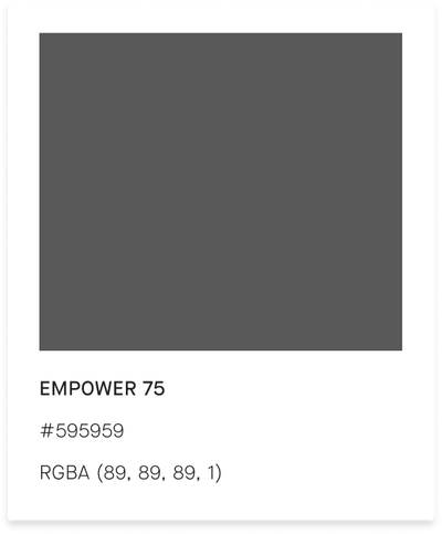
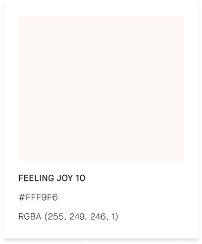
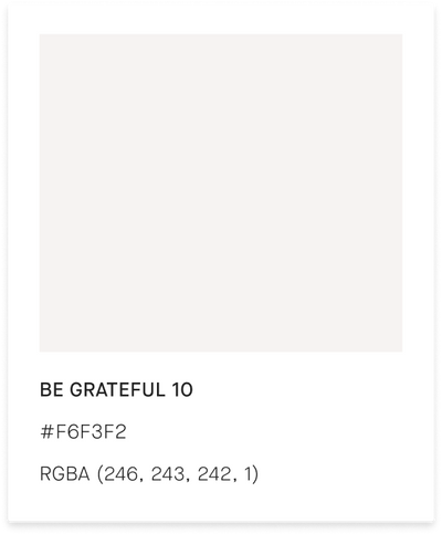
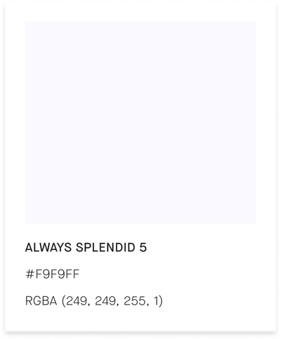
︎︎To adhere to the rule of fours, we selected four primary colors and four respective accent colors for each. The gem colors were chosen to represent the luxury space while also grounding the user. We also incorporated softer, brighter colors to complement the gem colors, illustrating how the brand is dynamic and serves as the intersection between luxury and fashion worlds.
Foundation Colors


Primary Colors
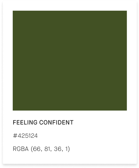
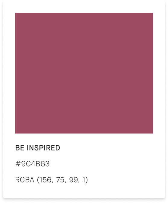
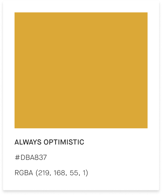
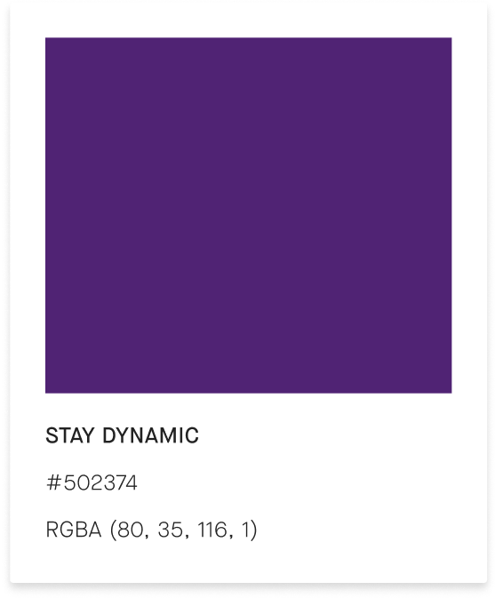


Accent Colors
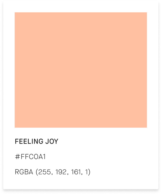
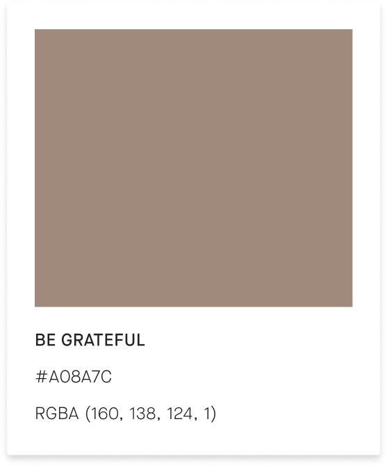
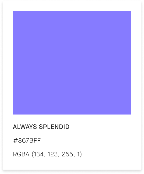


Tertiary Colors


Patterns
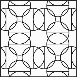
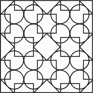
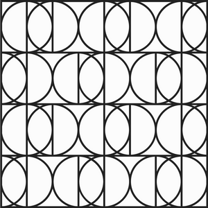
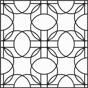
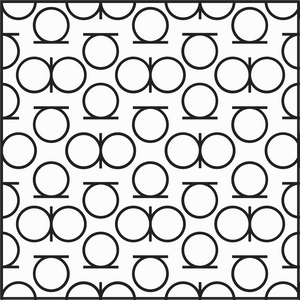
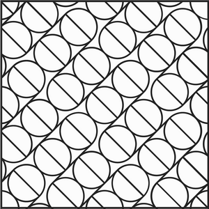
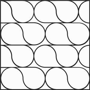
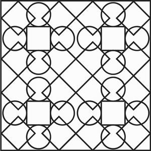
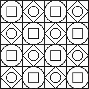
︎︎To enhance the visual identity of appreciate, we developed a pattern system using geometric shapes that resemble the logo mark. Our aim was to elevate ownership by empowering owners to make informed decisions about their belongings and find new utility in their existing items. Additionally, incorporating sophisticated patterns into the brand design ties back to luxury brands and their symbolic pattern systems, further reinforcing appreciate's position in the luxury fashion industry.

Icons and Illustrations
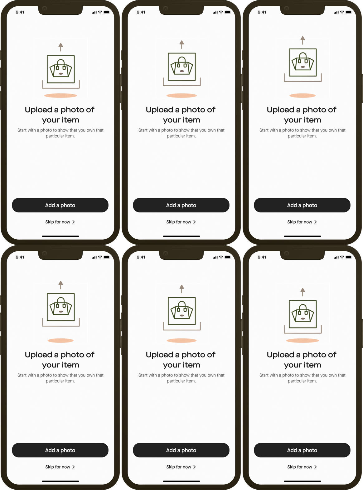
I created different sets of illustrations and icons that were used across the app, website, and other graphical assets. These sets were developed to convey different concepts in a visually appealing way while staying consistent with the overall branding style of Appreciate.
App Illustrations
︎︎The illustrations were created using a set of guidelines that I developed to ensure they were in line with the brand's visual identity. This included color palettes, typography, and the use of geometric shapes that were used in logomark and patterns




App Icons
︎︎As the needs of the project evolved, I continued to design and create new sets of icons to accommodate new features and functionalities. However, no matter the concept or purpose, each set followed the same consistent rules that were established during the rebranding process. This allowed for a cohesive and unified visual identity for the brand across all platforms and media.




Web Illustrations
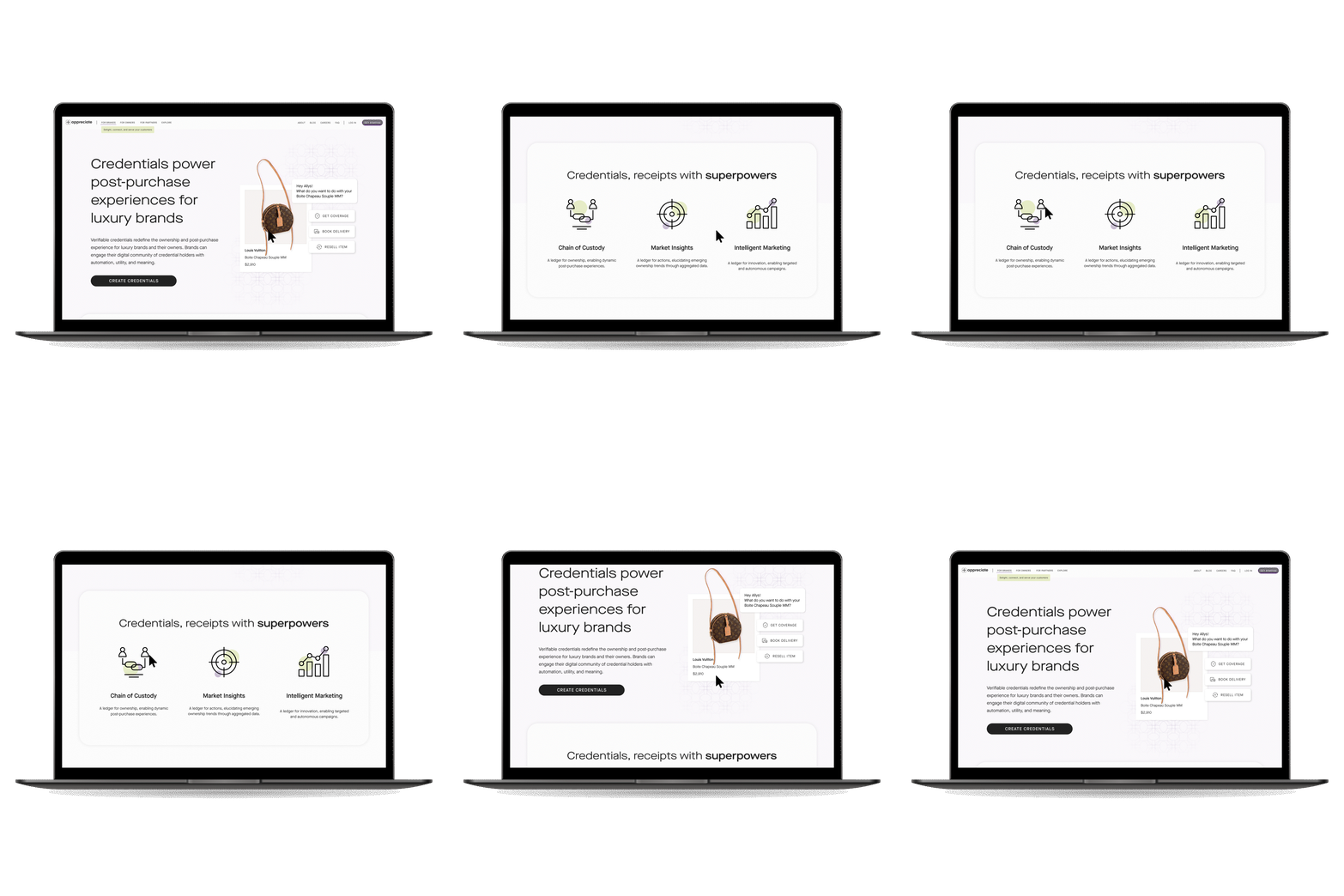
︎︎Web Illustrations were simillar to the App illustrations with different animation styles and different color palettes for each landing page.













Graphics’ Icons
︎︎For some of the imageries used throughout the website we created costum icons to tie them back to the overall branding.







Email Template Design
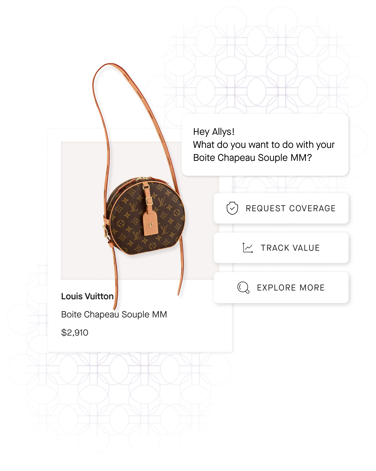
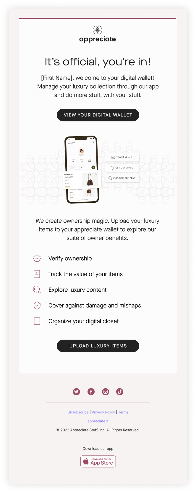
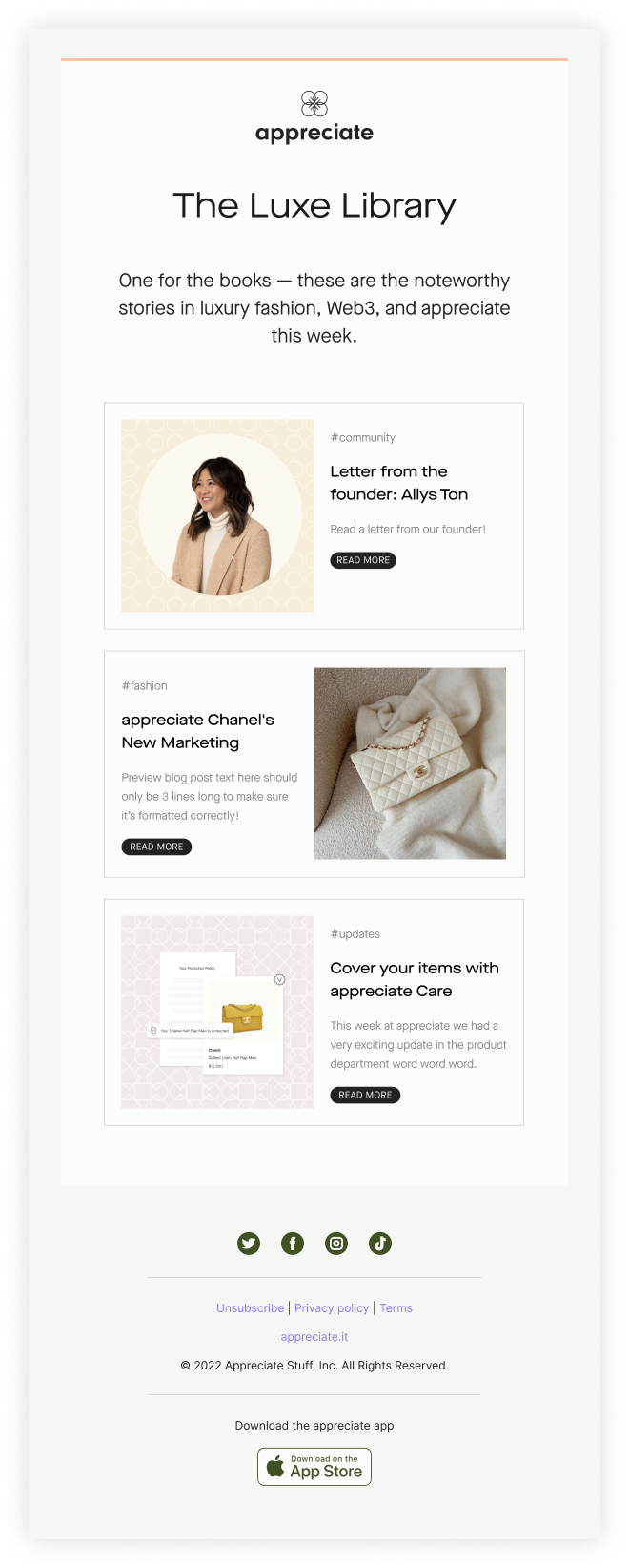
After the rebranding, I was assigned the task of designing email templates that align with the new brand identity. To ensure consistency, I assigned each type of email with one of our color pairs. As we were using Mailchimp for our email marketing at the time, I had to take into consideration the platform's limitations while designing the templates. Later on, we created our own custom Strapi template to better align with our branding.
Marketing Emails
![]()
![]()

Newsletter
![]()
![]()

Mobile View
︎︎

Apple App Store Collateral
App Icon
︎︎
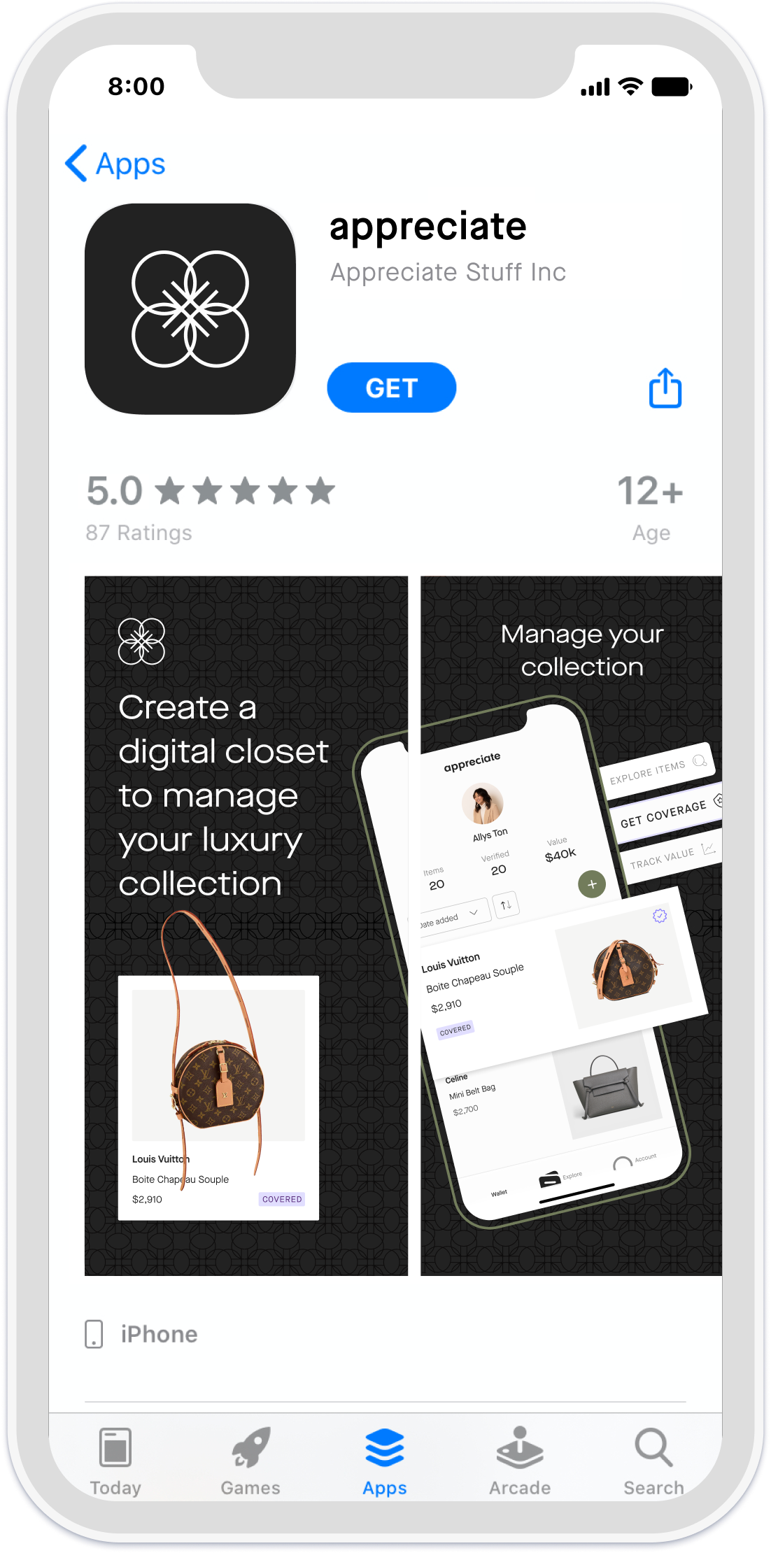
App Store Preview Screens
︎︎Based on the Apple app preview and screenshot specs I designed preview screens for Apple app store store and adjusted the design for different sizes and resolutions.
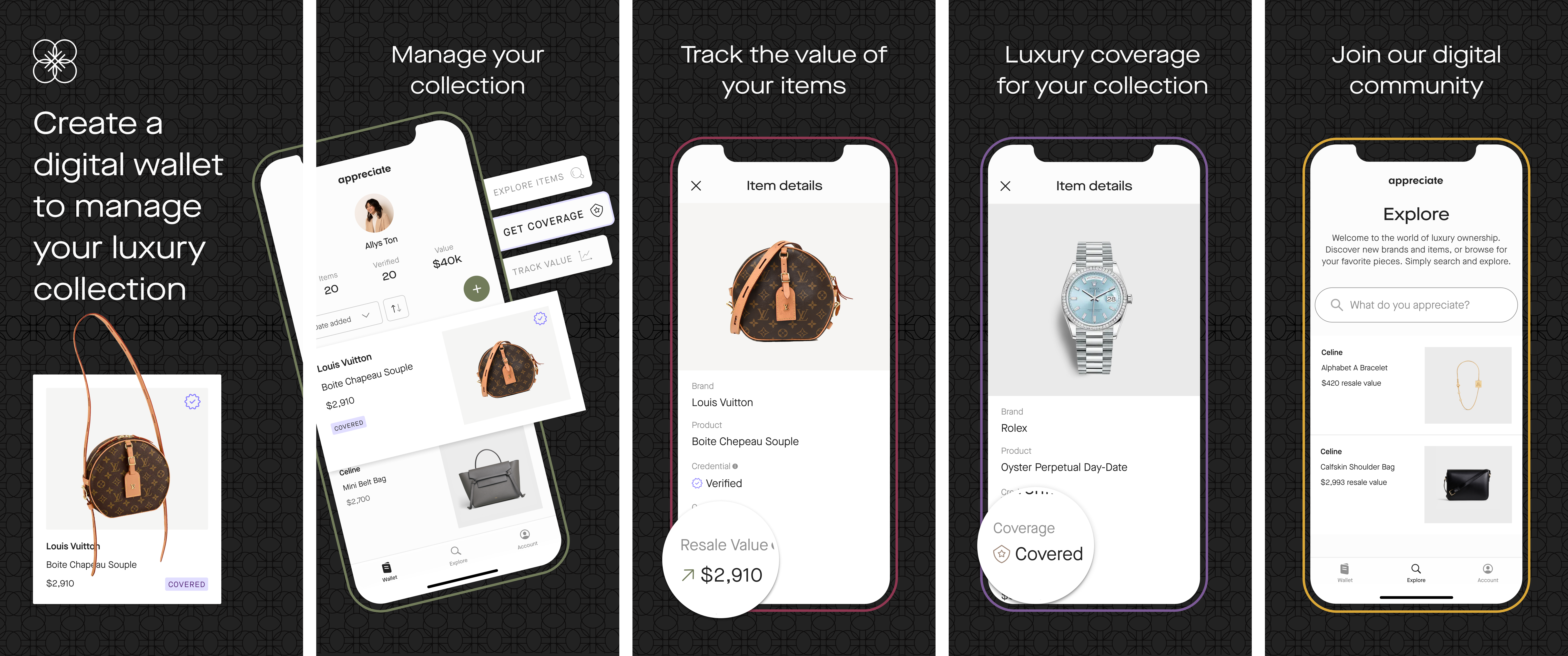
Designs for Social Media Platforms
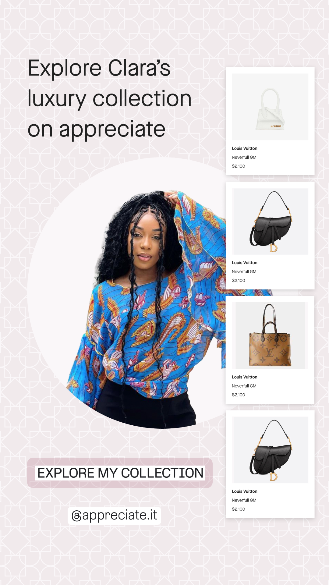
Here are some of the design examples used at appreciate for social media marketing. Although I helped with ideation and designing assets, most of the credit goes to the art director Bonnie Mounier and the social media director Grace Collora.
Celebrity Wallets
︎︎One of the campaigns we created for promoting the appreciate app was “Celebrity Wallet”. In addition to desktop formats used for in-person interactive events, we also had Pinterest and Instagram collaterals showcasing celebrities and influencer’s Appreciate wallets.
![Instagram story 1]()
![Instagram story 2]()
![Instagram story 3]()
![Instagram post]()



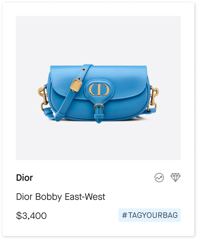
#tagyourbag Campaign
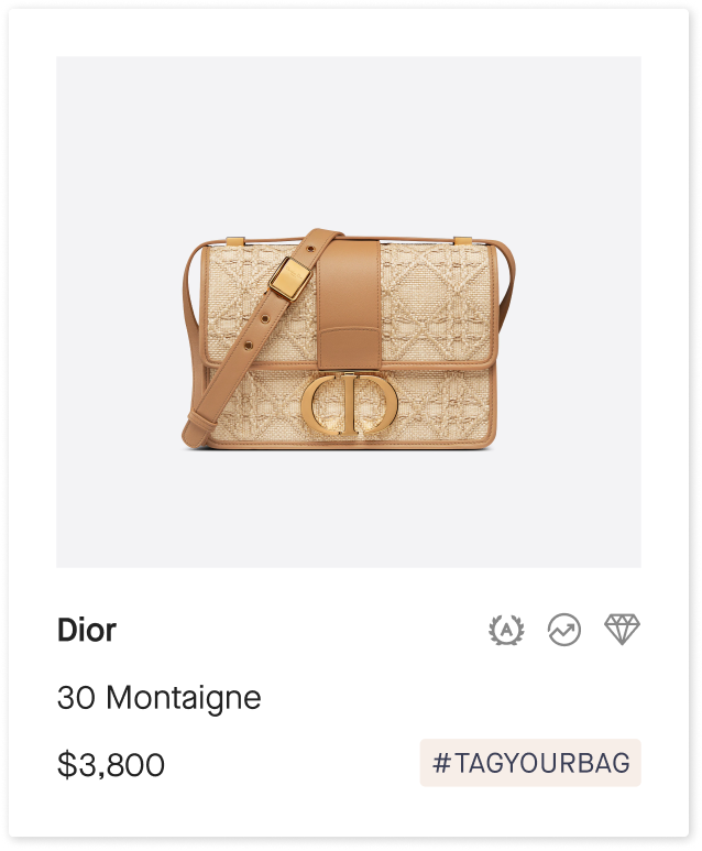
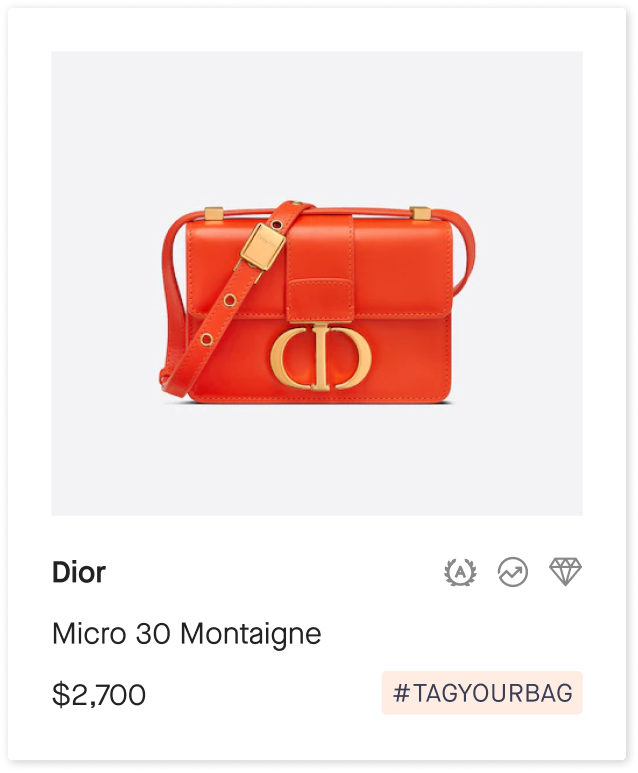
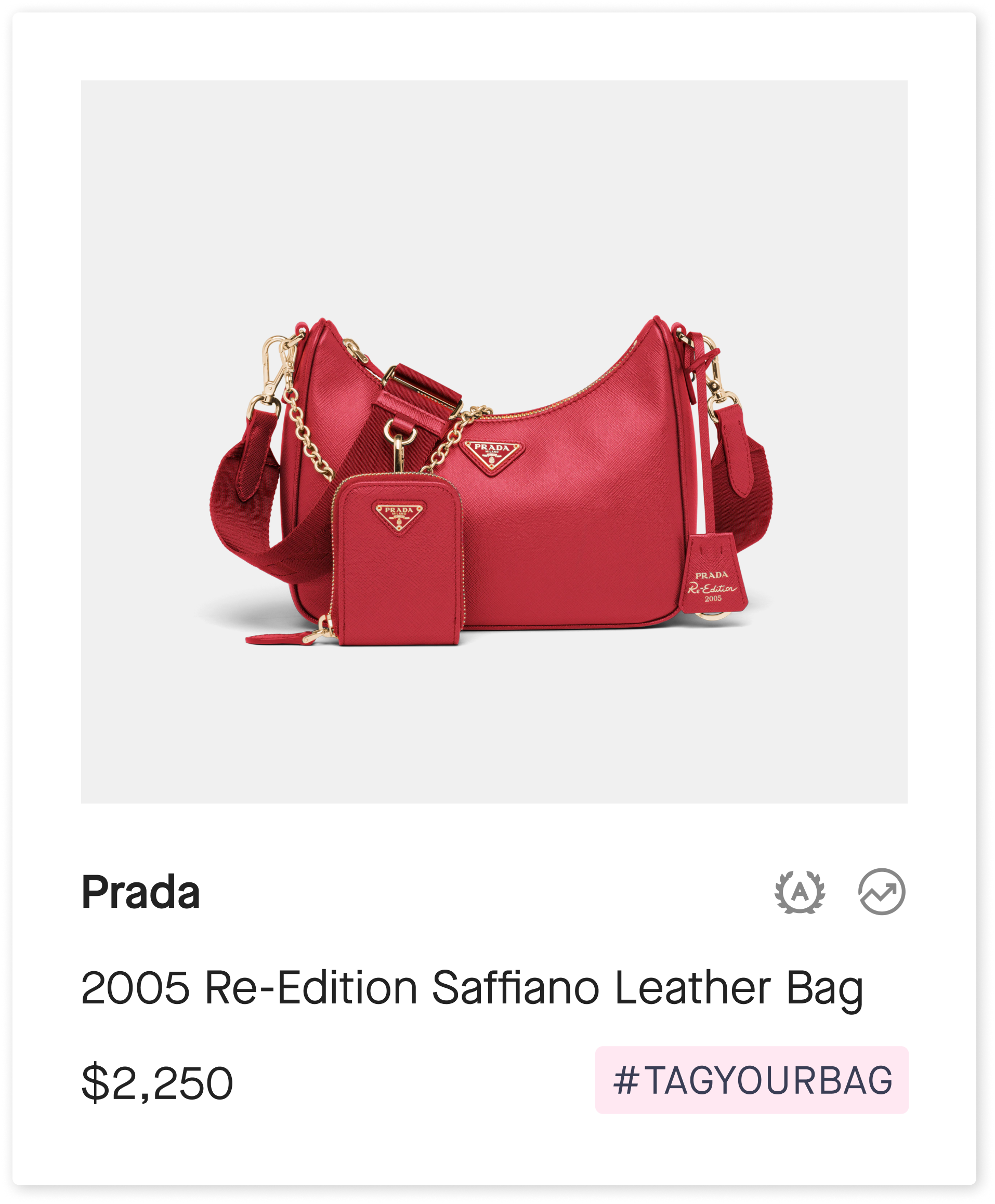
︎︎This campaign was an ambitious idea to create individual hashtags for popular bags and rederect them to different Appreciate-owned Instagram and pinterest accounts.
Profile Photos





Some of the bags used for the campaign


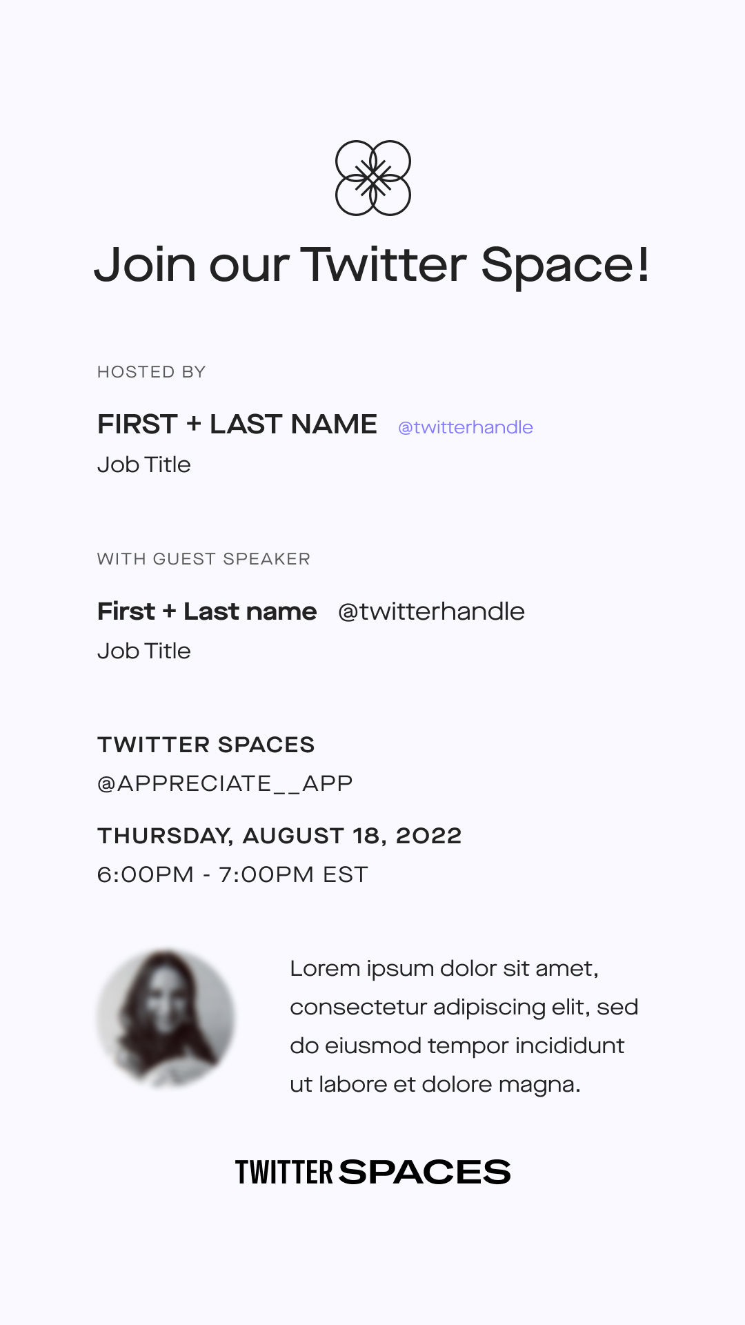
Twitter Space
︎︎Appreciate hosted weekly Twitter Space with different guests, mostly people with successful career’s in the field.
![Instagram template for promoting the event]()
Holiday Gift Guide
︎︎Appreciate version of the holiday gift guide for 2023.
![]()
![Cover of the guide magazine we created]()
