

Icons and Illustrations
As a Visual Designer at Appreciate, I created different sets of illustrations and icons that were used across the app, website, and other graphical assets. These sets were developed to convey different concepts in a visually appealing way while staying consistent with the overall branding style of Appreciate.
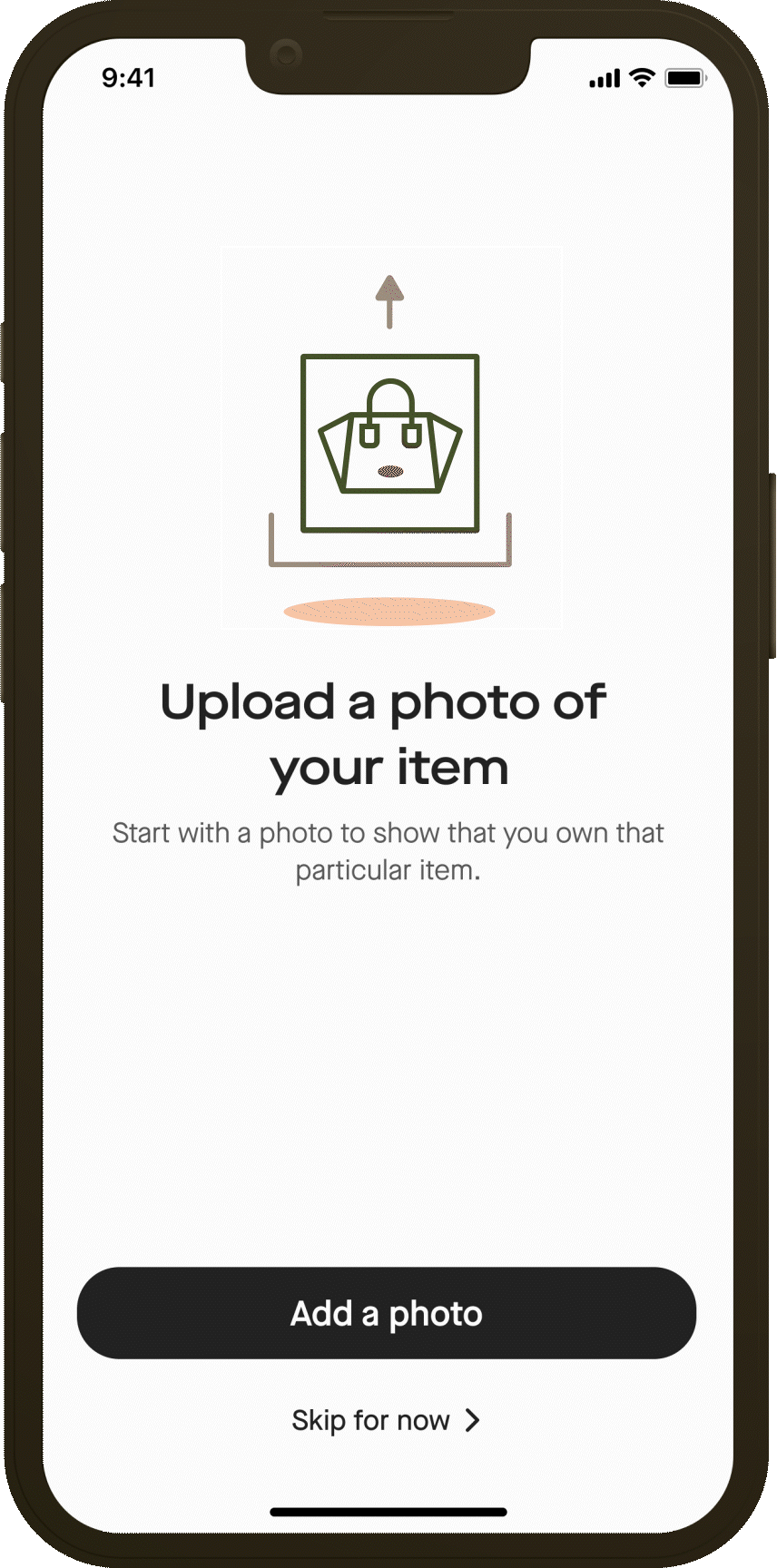
App Illustrations
︎︎The illustrations were created using a set of guidelines that I developed to ensure they were in line with the brand's visual identity. This included color palettes, typography, and the use of geometric shapes that were used in logomark and patterns.


App Icons
︎︎As the needs of the project evolved, I continued to design and create new sets of icons to accommodate new features and functionalities. However, no matter the concept or purpose, each set followed the same consistent rules that were established during the rebranding process. This allowed for a cohesive and unified visual identity for the brand across all platforms and media.


Web Illustrations
︎︎Web Illustrations were simillar to the App illustrations with different animation styles and different color palettes for each landing page.


Graphics’ Icons
︎︎For some of the imageries used throughout the website we created costum icons to tie them back to the overall branding.