

BU MFA Thesis Show Branding
Branding
Web Design
Motion Design
Publication Design
Social Media
For the 2020 MFA Thesis Show at Boston University, the branding team (Wei Yun Chen, Krystyn Wypasek, Julian Parikh, and I) developed a comprehensive and participatory system designed to fully represent all graduating Masters students from the programs housed in the School of Visual Arts. Due to the pandemic, the exhibition transitioned to a virtual format, requiring adjustments to the original plan.
![]()
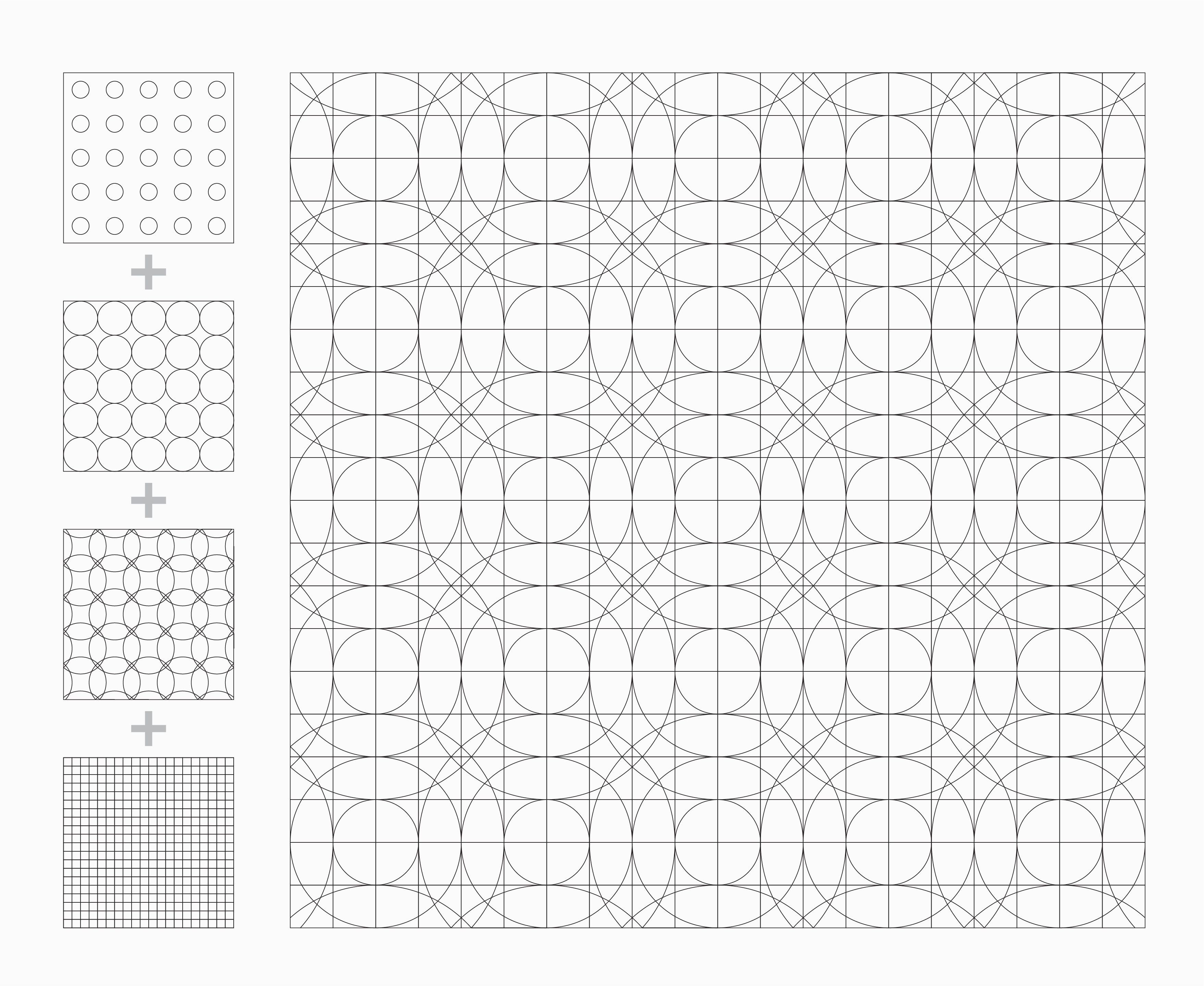
We created a custom 20x20 square grid with three layers of concentric circles, representing the 40 students graduating from the Graphic Design, Painting, and Sculpture programs within the School of Visual Arts.
![]()

We created a custom 20x20 square grid with three layers of concentric circles, representing the 40 students graduating from the Graphic Design, Painting, and Sculpture programs within the School of Visual Arts.

We selected a diverse range of colors to represent our distinct programs, aiming to celebrate our diversity. Additionally, we incorporated brighter hues to add a joyful and energetic touch to our overall brand.


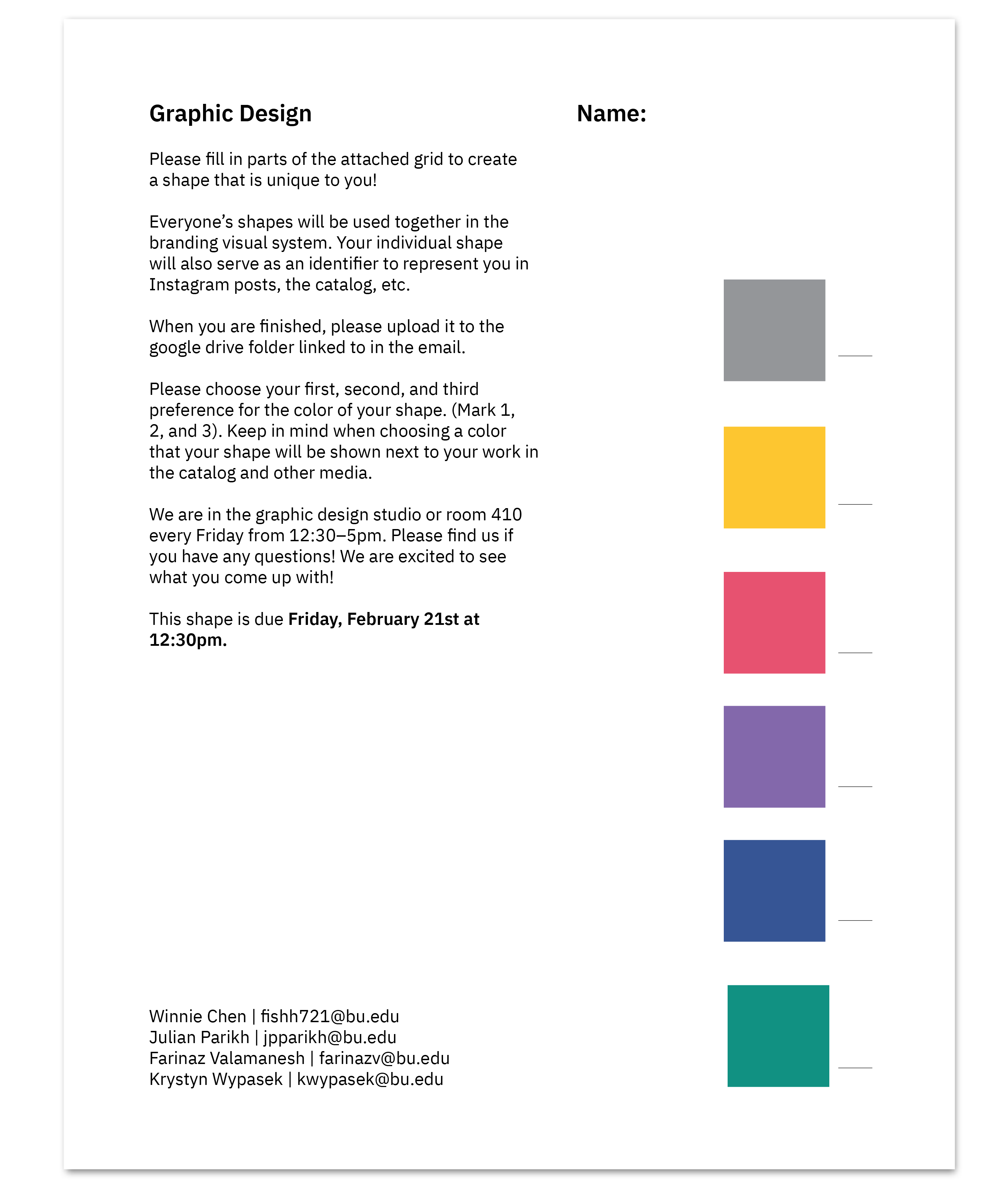
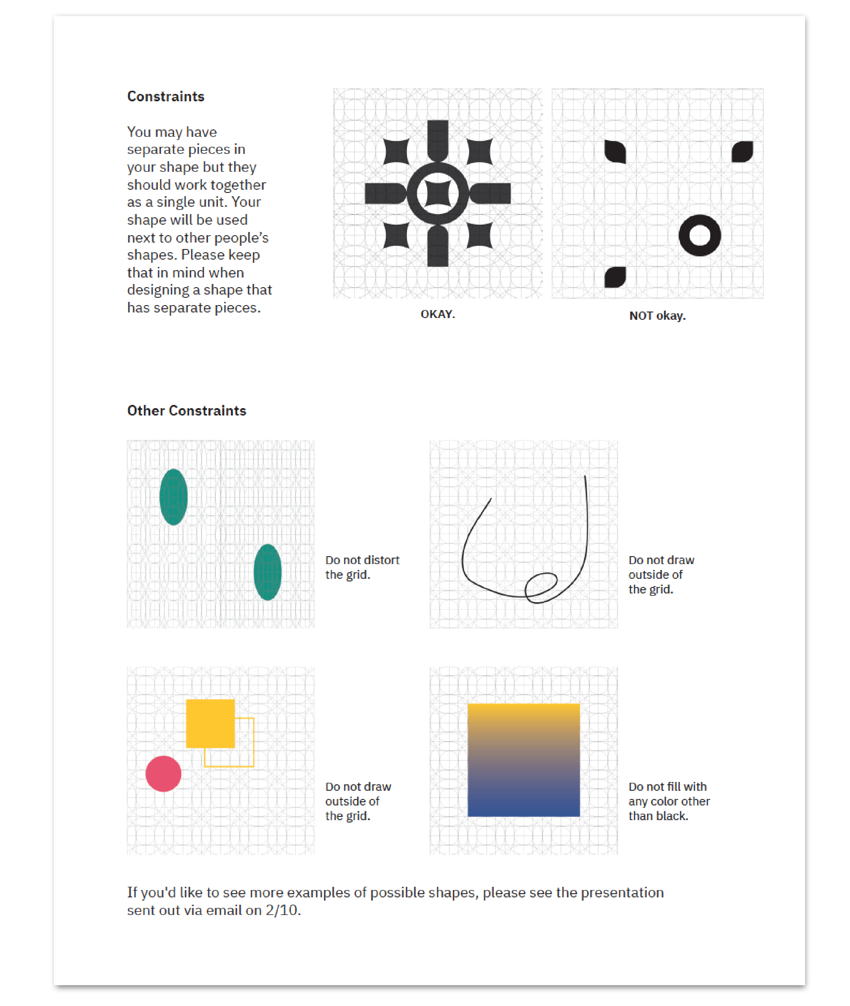
The grid served as the foundation for every aspect of the system, and it was distributed to each student who was asked to create their own unique identifier. The resulting 40 shapes came together to represent each student across all print and digital media.


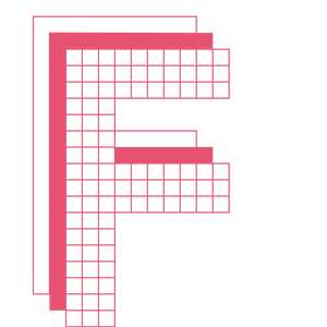


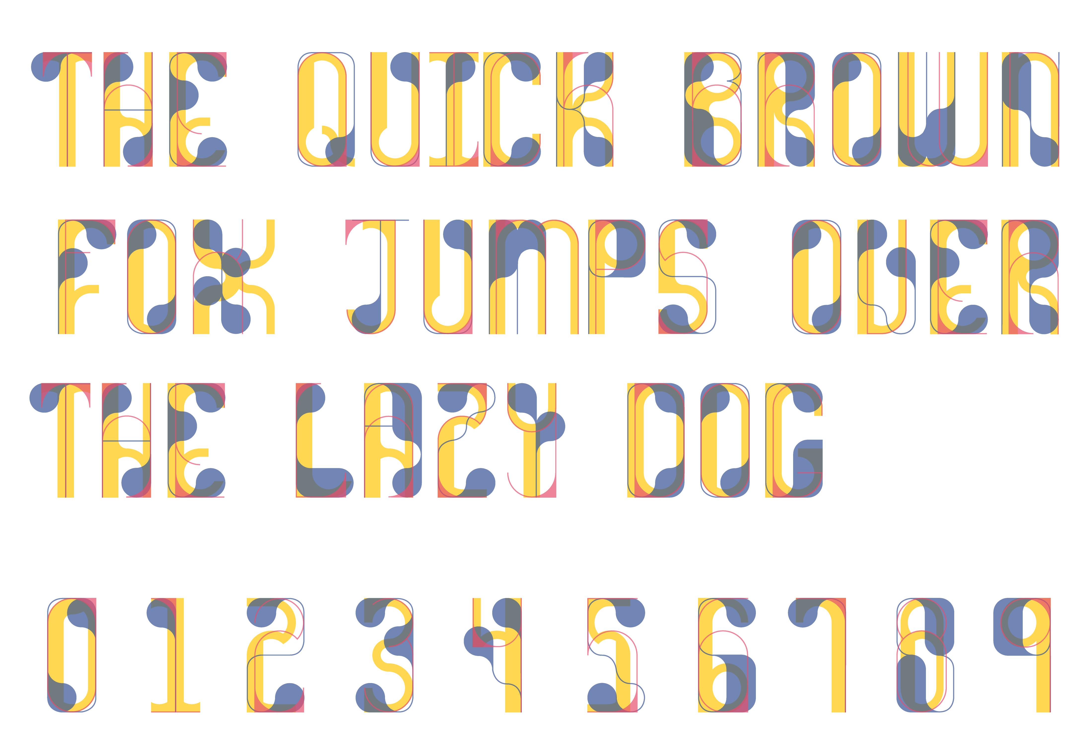
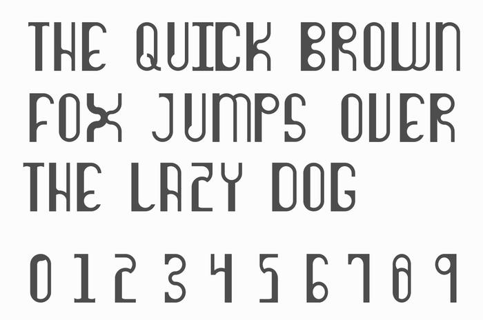
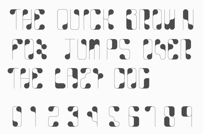
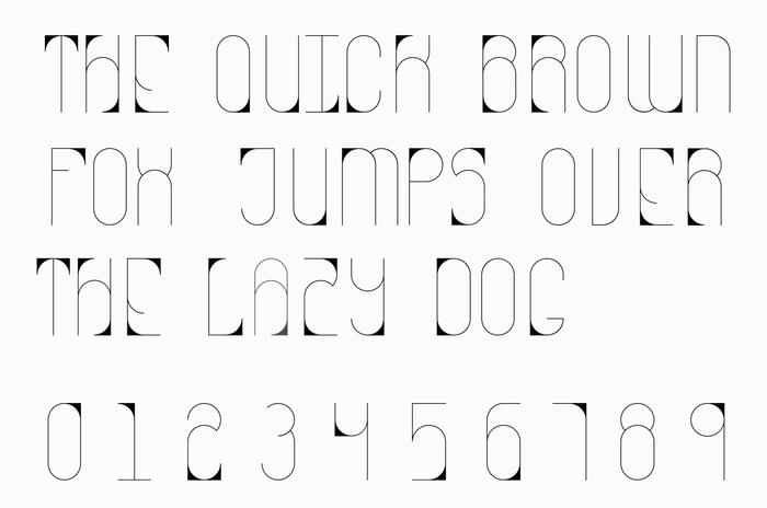
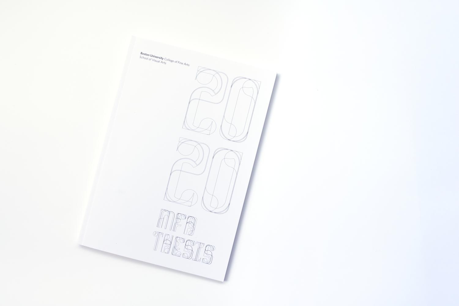
The grid also served as the foundation for a series of custom typefaces we created for the show. We utilized the complex grid to produce numerous letterforms, ultimately selecting three that we refined into complete alphabets. These three alphabets represent our three programs in one school. The Chunky alphabet, with its heaviest weight, always appears on the bottom. The Fishy alphabet, featuring thicker terminals and thinner strokes, is the transitional typeface and appears in the middle of the layering. The Narrow alphabet, with the thinnest weight of all three, always appears as the top layer.

Tisa is our secondary typeface choice due to its legibility and suitability for long text passages on the web. It is a serif typeface created by Mitja Miklavčič in 2006 and has a large x-height. Additionally, it pairs well with both Tisa Pro and our 3-layered typeface.


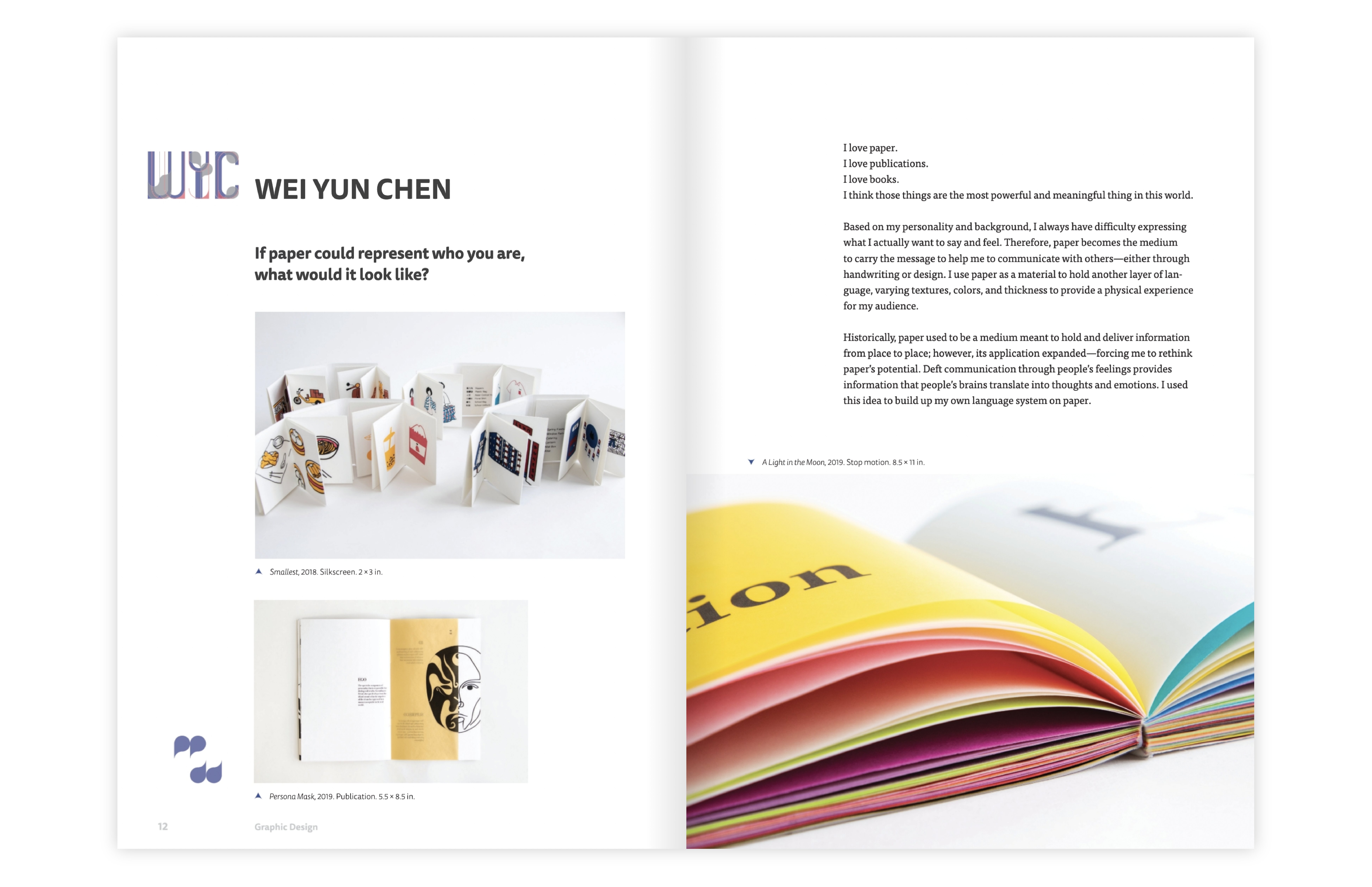
With the shapes that students had made and the three typefaces, we created a thesis catalog showcasing student’s thesis statements and relevant works. The first two pages of the catalog are printed on a translucent paper, enabling readers to see the typefaces, and the list of students in each program, individually as well as together.


As a result of the pandemic, our team adapted our branding project for the virtual MFA Thesis Show. We designed a website to showcase the students' thesis projects online. This allowed us to provide a platform for the students to display their work and share it with a wider audience.

We created an Instagram page as a virtual platform to showcase the students' work and maintain consistency with our branding. Each student is represented by their unique shape, and their work is displayed in the subsequent posts.
For more branding projects check out these: