
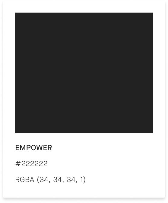
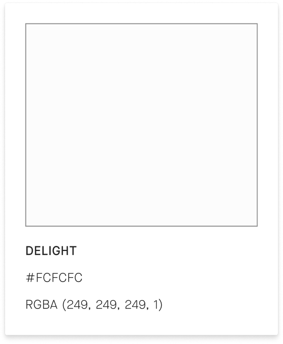
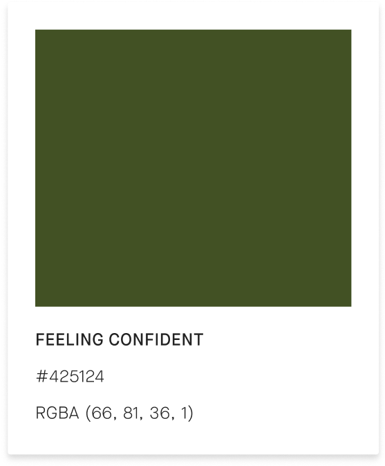
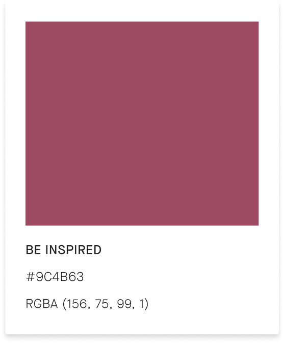
Appreciate Rebranding Project
During the rebranding project for Appreciate, we realized that the existing brand did not accurately represent the company's values and mission. Thus, we initiated a complete overhaul to better align the brand with the company's objectives. To guide our efforts, we asked ourselves critical questions about Appreciate's purpose, perception, and positioning in the luxury goods industry within the Web3 space.
Process
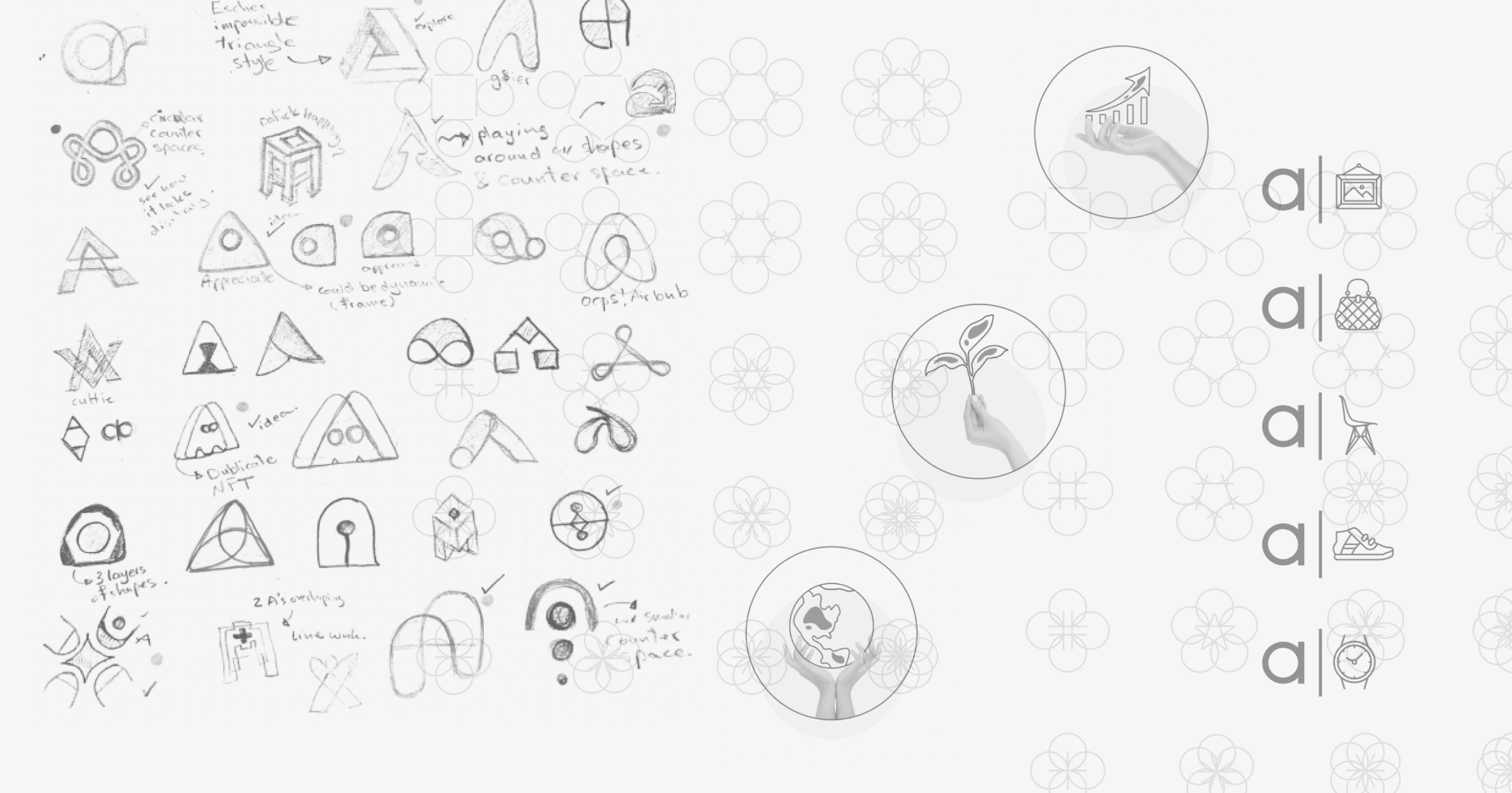
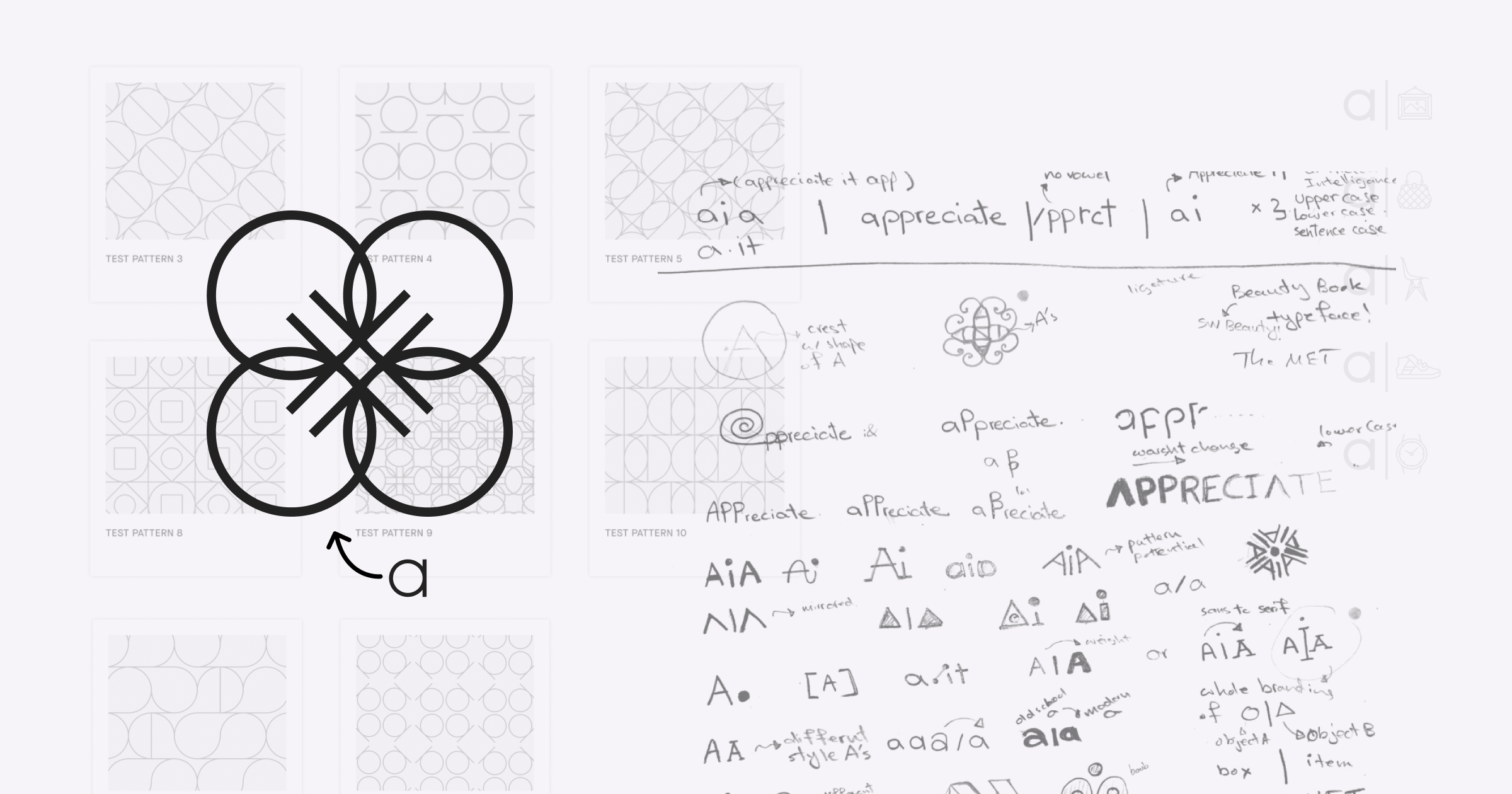
︎︎We approached the rebranding with a comprehensive design process, beginning with ideation and conceptualization, followed by several rounds of brainstorming, sketching, and multiple iterations, and culminating in the production of various assets for the new brand. We understood that Appreciate required a brand that effectively communicated its values and mission. As such, we focused on creating a brand that would accurately represent what Appreciate does and stands for. The rebranding process was a collaborative effort across the entire design team at Appreciate, resulting in a truly remarkable outcome.


Logo
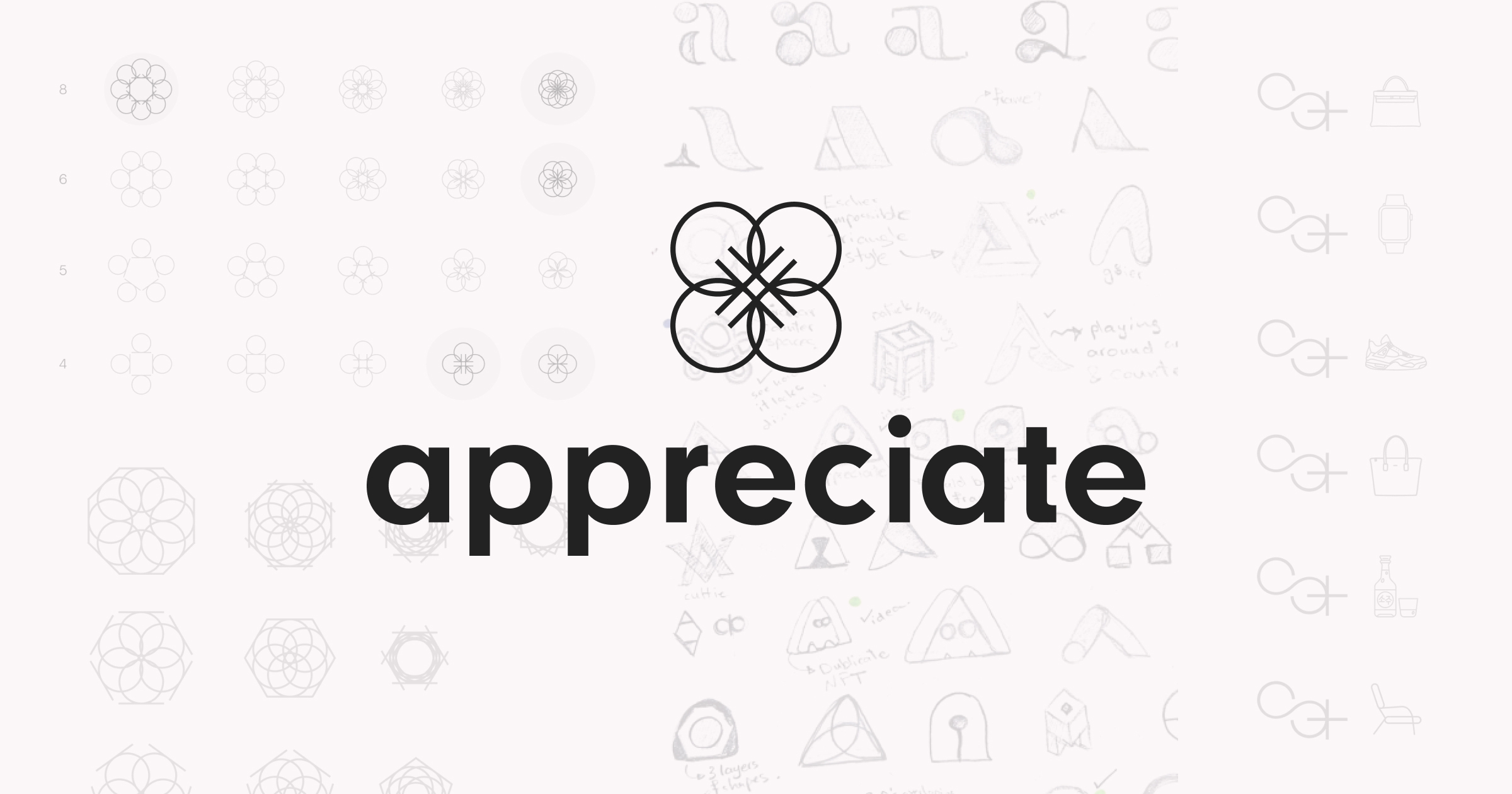
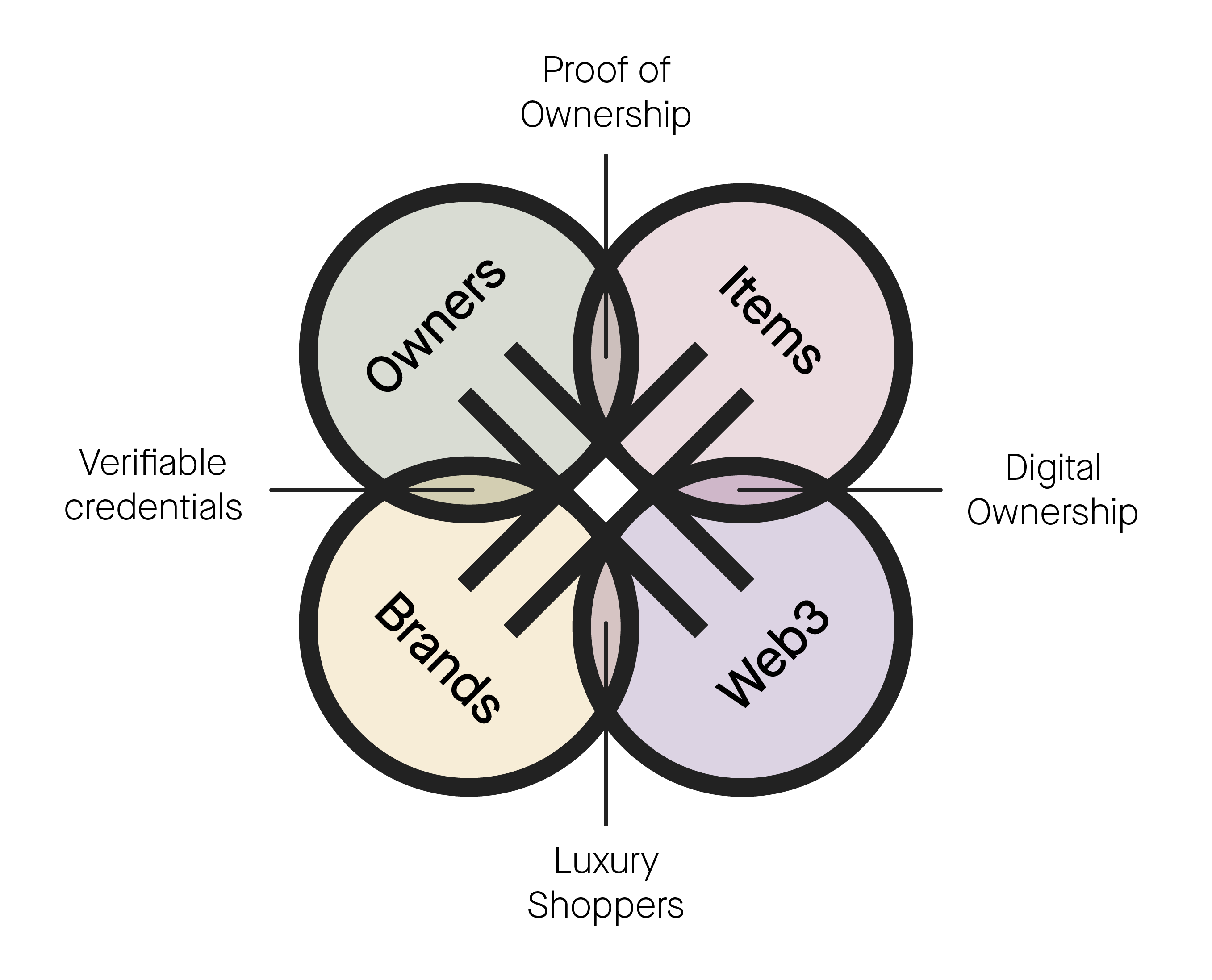
︎︎The number four holds a special significance in the new appreciate brand. The new logo features a clover made up of four intertwined a's, symbolizing the role of the appreciate platform in connecting brands, partners, owners, and luxury items.
Vertical and Horizontal Lockup
![]()
![]()
Light and Dark Backgrounds
![]()
![]()


Light and Dark Backgrounds
Type
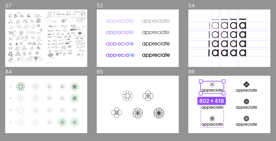
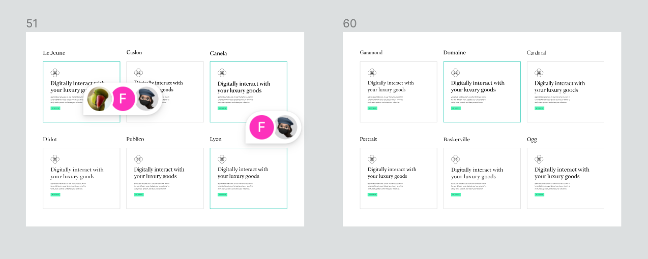
︎︎To fit with the tech-focused aesthetic of appreciate, we sought out a clean and modern sans serif font with a touch of character. After exploring various options, we selected Maison Neue as our typeface of choice. This versatile font works exceptionally well in the digital space and adds a unique touch to the overall brand identity.
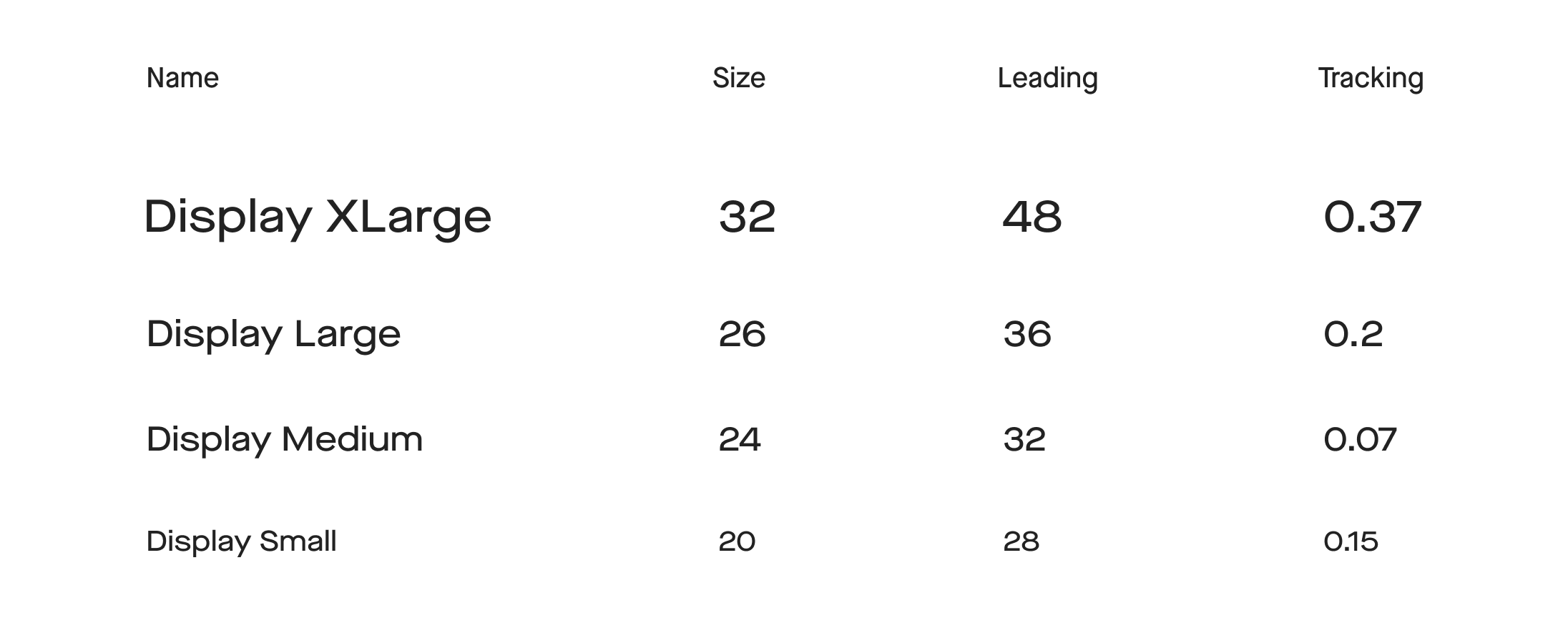
Type System
![]()
![]()
![Thank you Rob for our Kestrel System]()
![]()


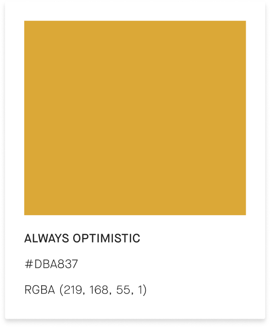
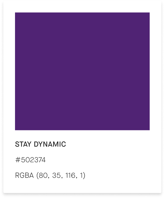
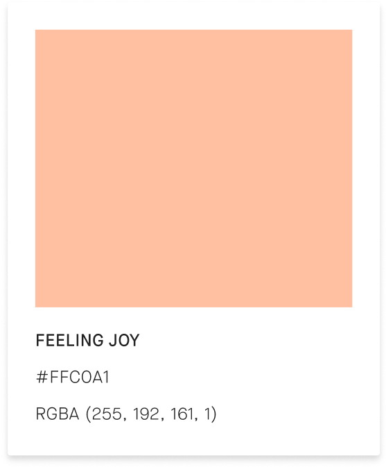
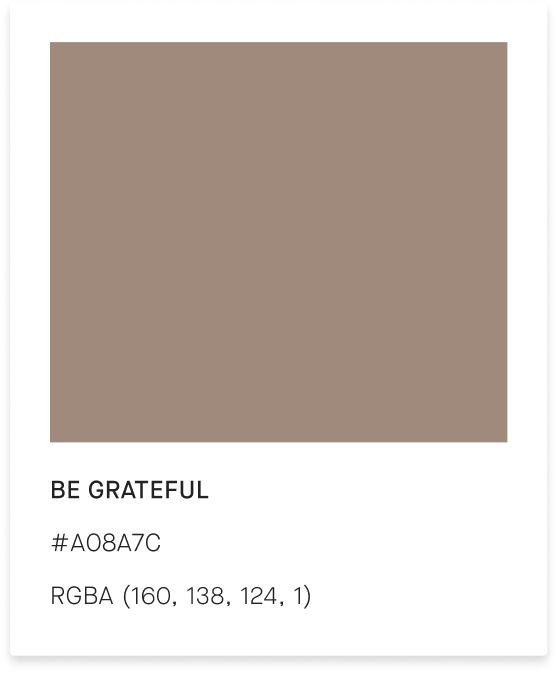
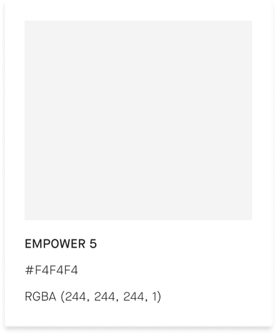
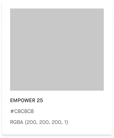
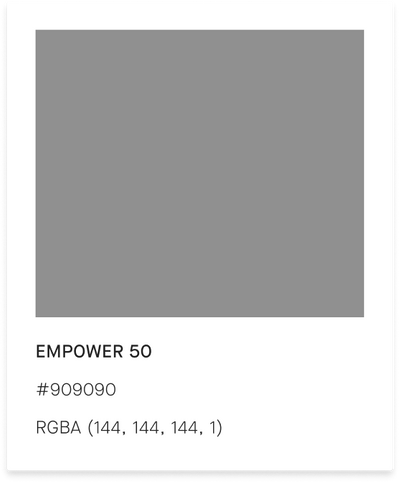
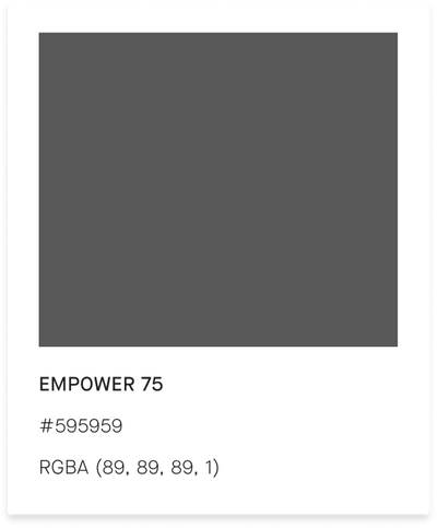
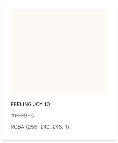
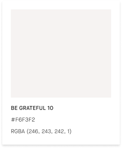
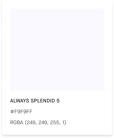
Color Palette
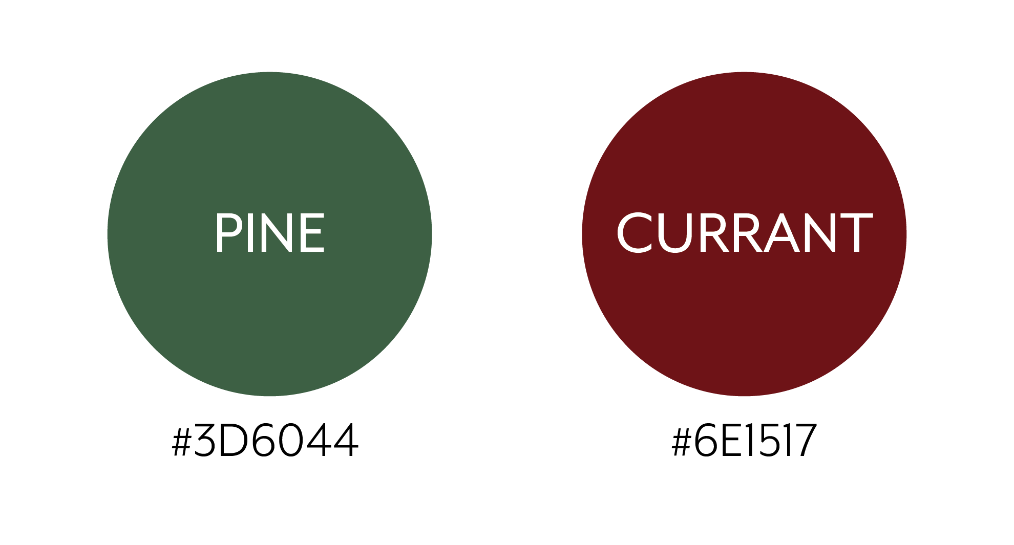
︎︎To adhere to the rule of fours, we selected four primary colors and four respective accent colors for each. The gem colors were chosen to represent the luxury space while also grounding the user. We also incorporated softer, brighter colors to complement the gem colors, illustrating how the brand is dynamic and serves as the intersection between luxury and fashion worlds.
Foundation Colors
Primary Colors
Accent Colors
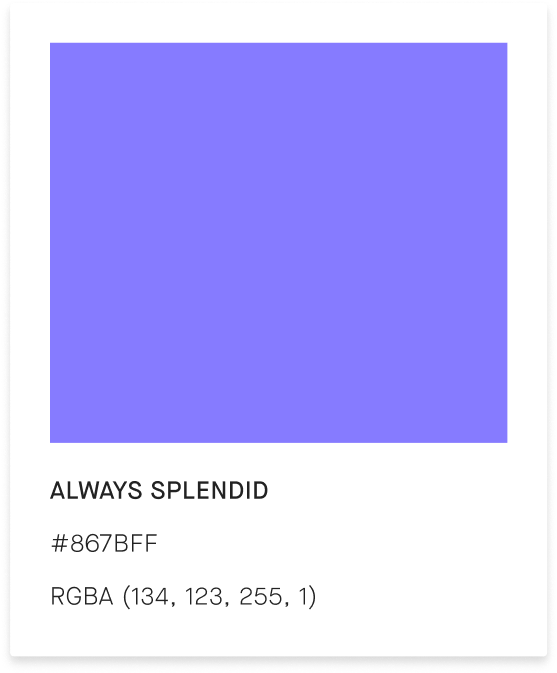

Tertiary Colors

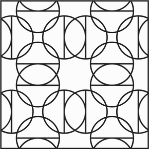
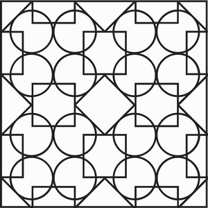
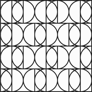
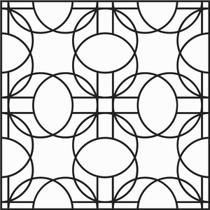
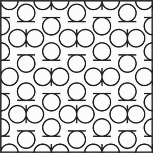
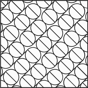
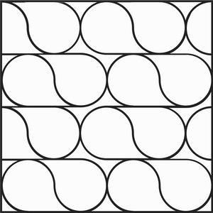
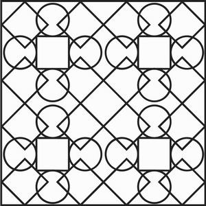
Patterns
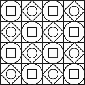
︎︎To enhance the visual identity of appreciate, we developed a pattern system using geometric shapes that resemble the logo mark. Our aim was to elevate ownership by empowering owners to make informed decisions about their belongings and find new utility in their existing items. Additionally, incorporating sophisticated patterns into the brand design ties back to luxury brands and their symbolic pattern systems, further reinforcing appreciate's position in the luxury fashion industry.

Icons and Illustrations
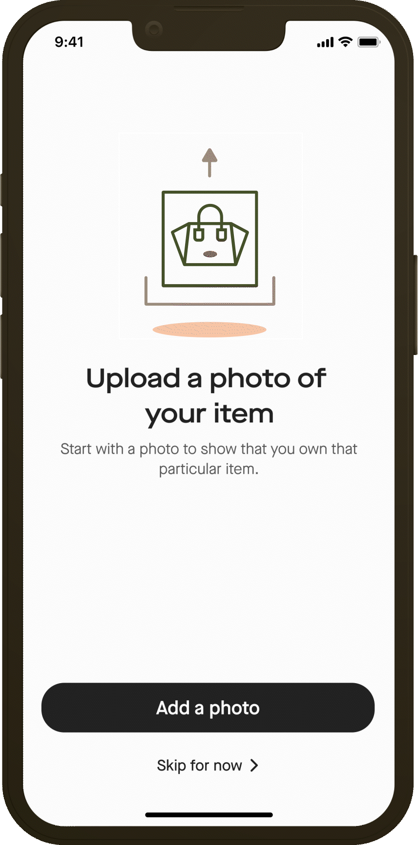
I created different sets of illustrations and icons that were used across the app, website, and other graphical assets. These sets were developed to convey different concepts in a visually appealing way while staying consistent with the overall branding style of Appreciate.
App Illustrations
︎︎The illustrations were created using a set of guidelines that I developed to ensure they were in line with the brand's visual identity. This included color palettes, typography, and the use of geometric shapes that were used in logomark and patterns


App Icons
︎︎As the needs of the project evolved, I continued to design and create new sets of icons to accommodate new features and functionalities. However, no matter the concept or purpose, each set followed the same consistent rules that were established during the rebranding process. This allowed for a cohesive and unified visual identity for the brand across all platforms and media.


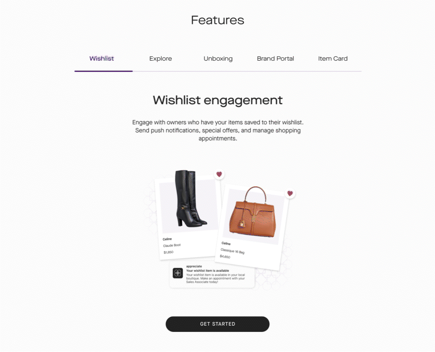
Web Illustrations
︎︎Web Illustrations were simillar to the App illustrations with different animation styles and different color palettes for each landing page.


Graphics’ Icons
︎︎For some of the imageries used throughout the website we created costum icons to tie them back to the overall branding.


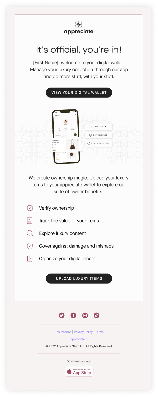
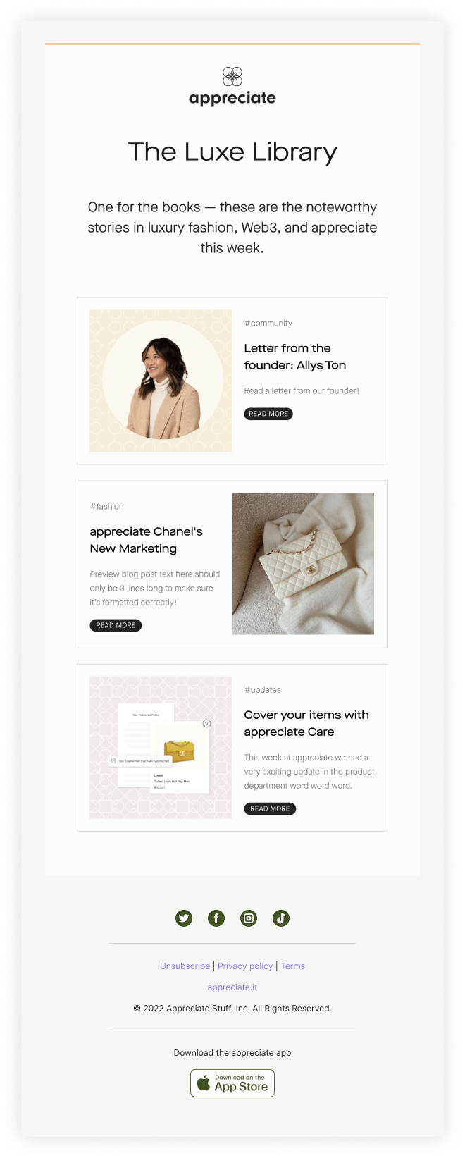
Email Template Design
After the rebranding, I was assigned the task of designing email templates that align with the new brand identity. To ensure consistency, I assigned each type of email with one of our color pairs. As we were using Mailchimp for our email marketing at the time, I had to take into consideration the platform's limitations while designing the templates. Later on, we created our own custom Strapi template to better align with our branding.
Marketing Emails
![]()
![]()

Newsletter
![]()
![]()

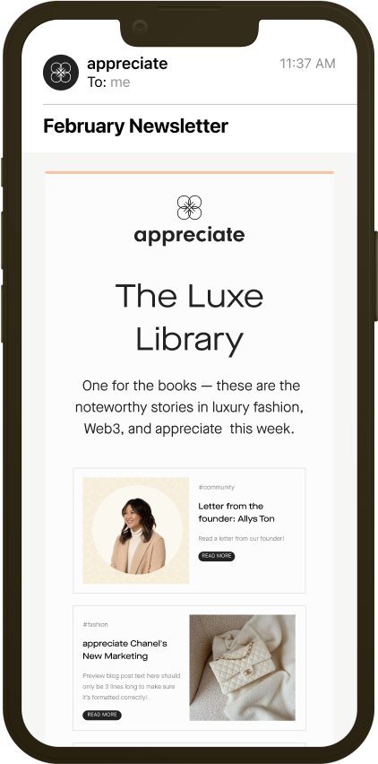
Mobile View
︎︎

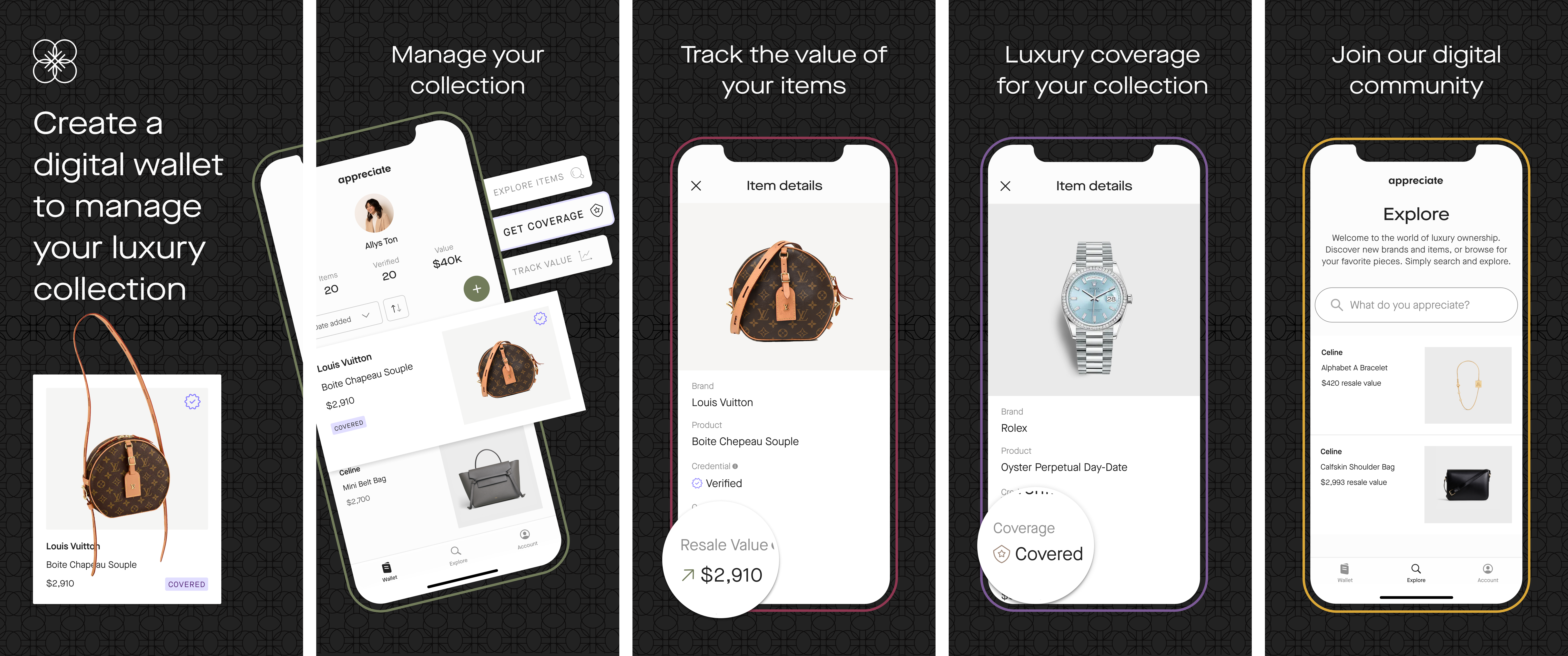
Apple App Store Collateral
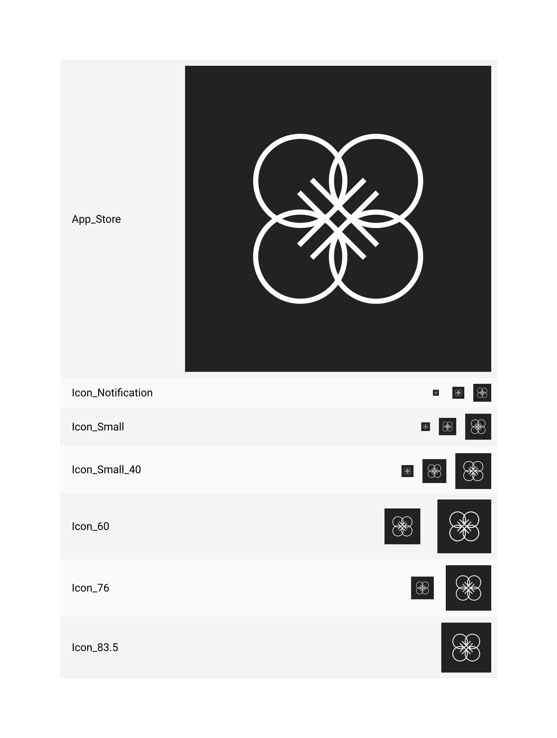
App Icon
︎︎
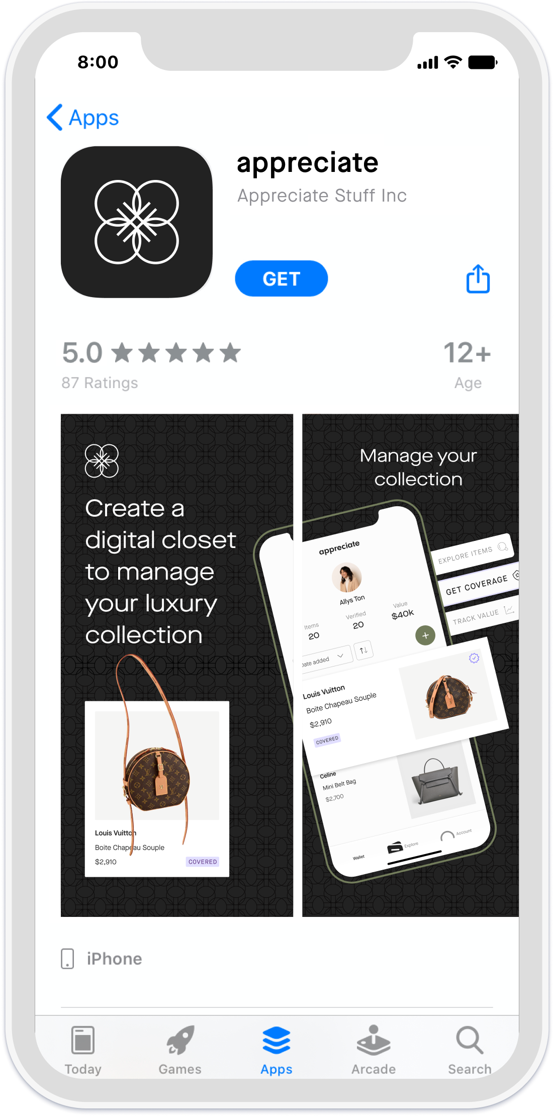
App Store Preview Screens
︎︎Based on the Apple app preview and screenshot specs I designed preview screens for Apple app store store and adjusted the design for different sizes and resolutions.
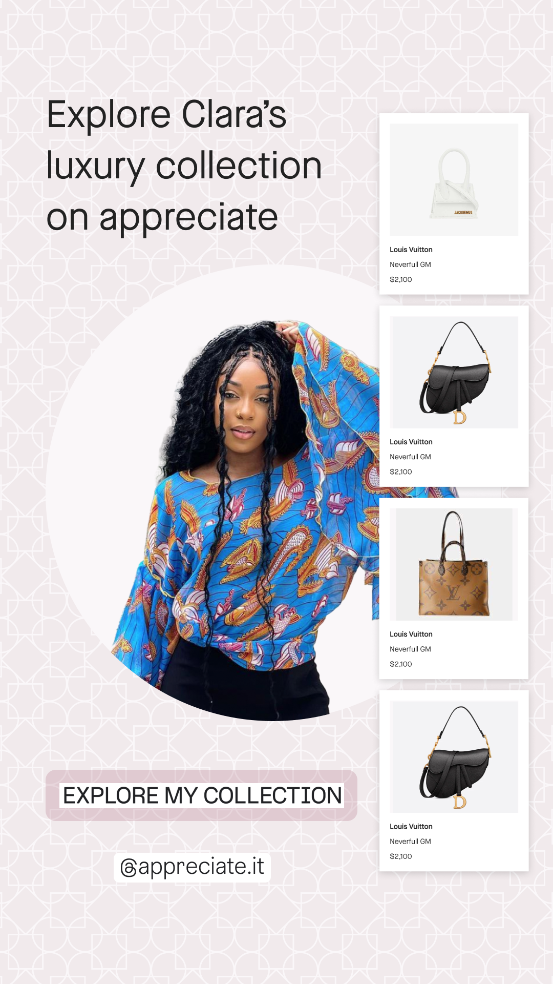
Designs for Social Media Platforms
Here are some of the design examples used at appreciate for social media marketing. Although I helped with ideation and designing assets, most of the credit goes to the art director Bonnie Mounier and the social media director Grace Collora.
Celebrity Wallets
︎︎One of the campaigns we created for promoting the appreciate app was “Celebrity Wallet”. In addition to desktop formats used for in-person interactive events, we also had Pinterest and Instagram collaterals showcasing celebrities and influencer’s Appreciate wallets.
![Instagram story 1]()
![Instagram story 2]()
![Instagram story 3]()
![Instagram post]()


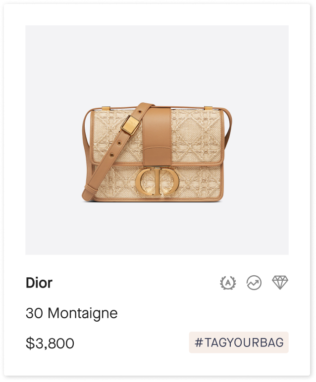
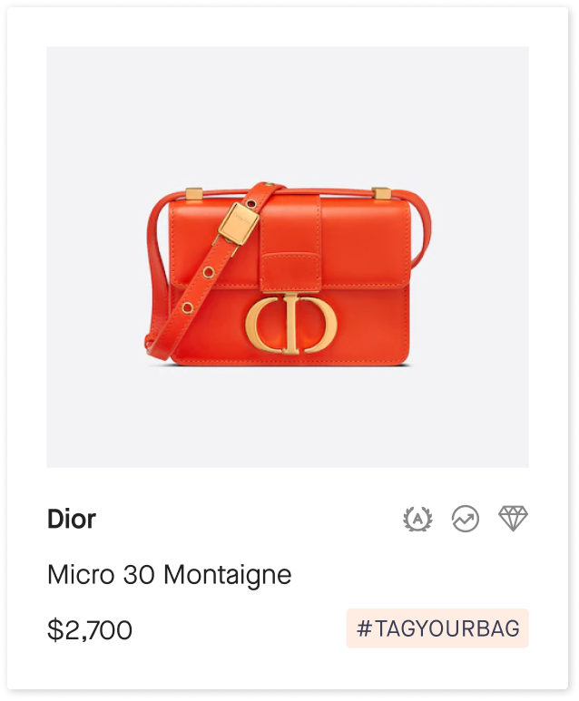
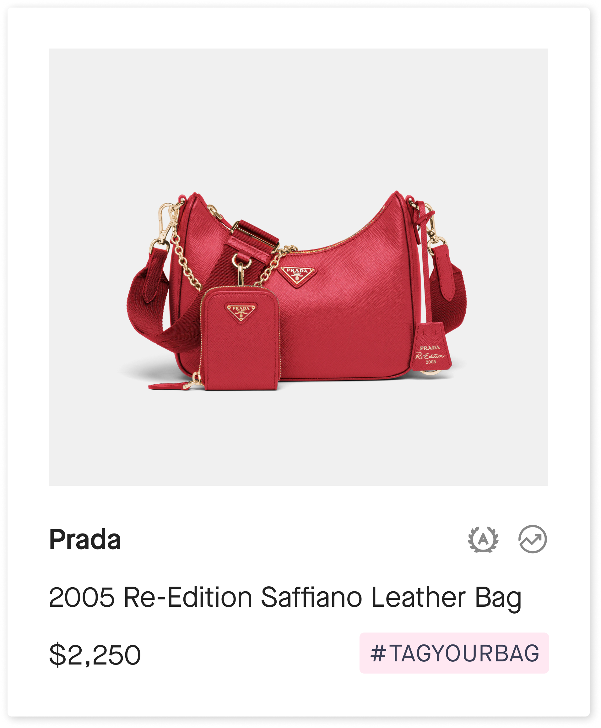
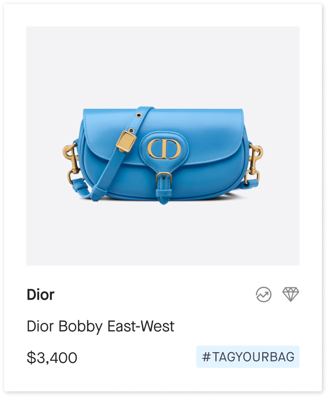
#tagyourbag Campaign
︎︎This campaign was an ambitious idea to create individual hashtags for popular bags and rederect them to different Appreciate-owned Instagram and pinterest accounts.
Profile Photos


Some of the bags used for the campaign


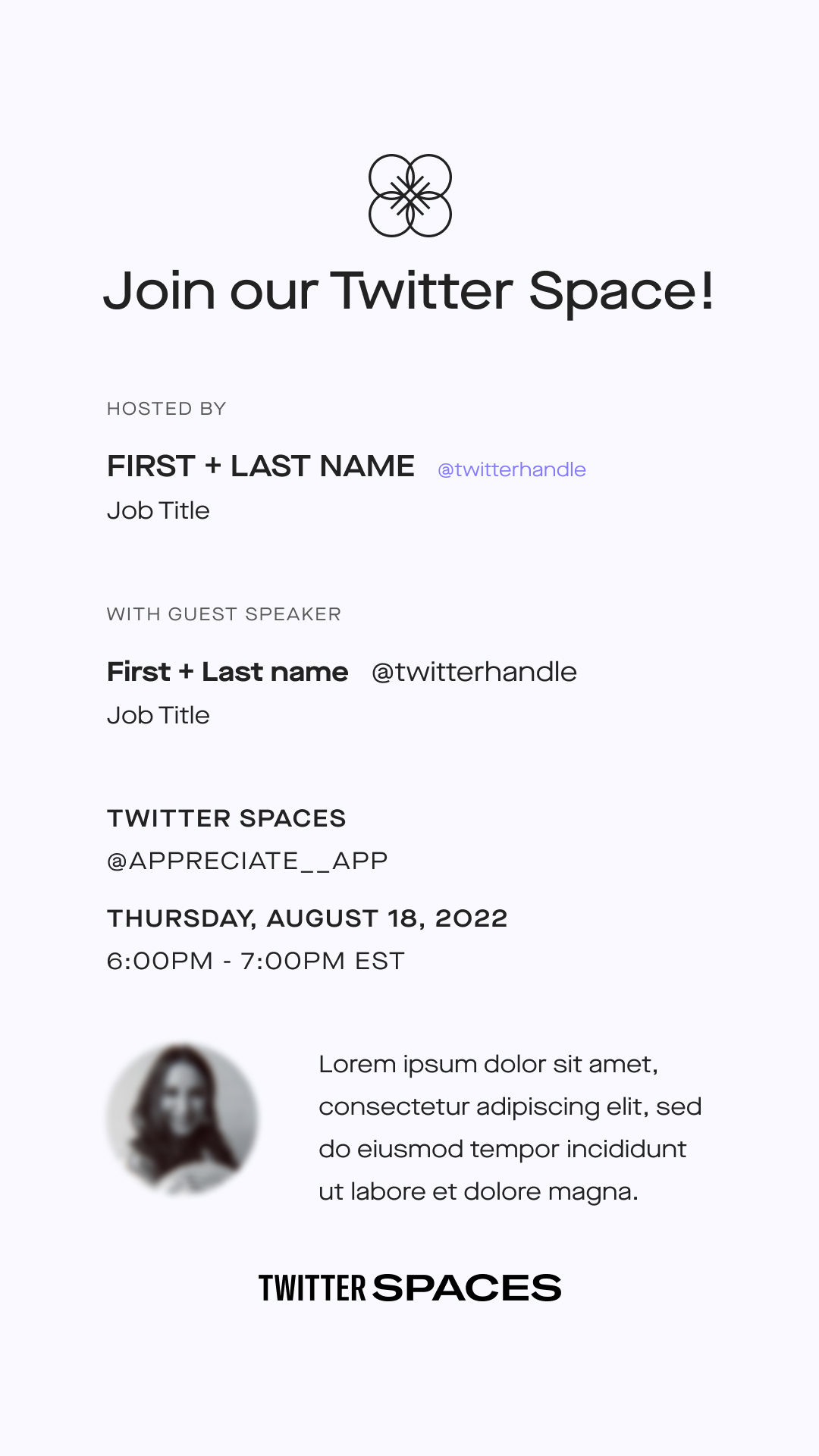
Twitter Space
︎︎Appreciate hosted weekly Twitter Space with different guests, mostly people with successful career’s in the field.
![Instagram template for promoting the event]()
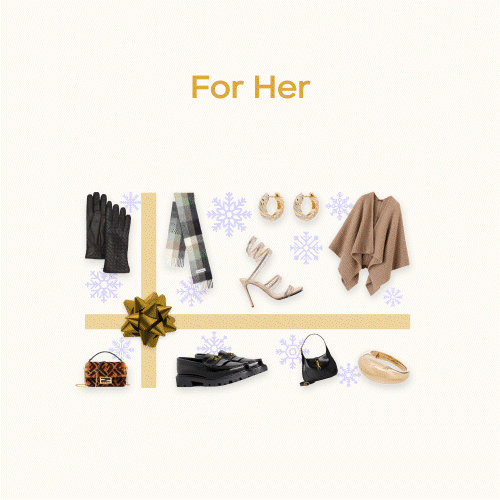
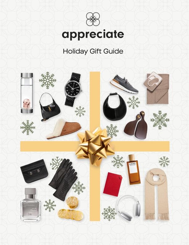
Holiday Gift Guide
︎︎Appreciate version of the holiday gift guide for 2023.
![]()
![Cover of the guide magazine we created]()
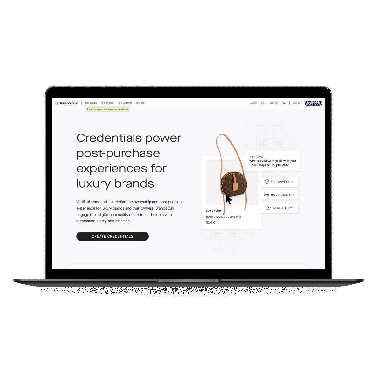
Website Redesign
Appreciate is a social commerce platform designed to help people curate and showcase their most meaningful possessions, turning the "stuff" we own into a digital portfolio of our unique styles.

After the completion of the appreciate rebranding project, it was important for us to make sure that our website matched the new look and feel of the brand. We started by completely redesigning the layout of the website, taking into account our newly chosen color pairs and patterns that we had created as part of the rebranding process.
Quick Summary
︎︎My Role
Visual Designer
Visual Designer
Problem
The Appreciate site experience no longer reflected the brand and provided a confusing product experience to users new and old.
Solution
As part of the team at Appreciate, we redesigned the website to align to the new company branding and bring consistency and clarity to who each page.
The Appreciate site experience no longer reflected the brand and provided a confusing product experience to users new and old.
Solution
As part of the team at Appreciate, we redesigned the website to align to the new company branding and bring consistency and clarity to who each page.
Contributions
• Integration of new brand styling to UI
• Creation of brand UI guidelines & governance
• Wireframing
• Component design
• Page layout design
• Integration of new brand styling to UI
• Creation of brand UI guidelines & governance
• Wireframing
• Component design
• Page layout design
Full Breakdown
︎︎The Foundational Elements
We began this process with defining how the new color palette and typeface would be used in the system.
For the color palette tokens more specifically, this involved defining the user personas the site needed to be tailored to and how they should be distinguished. The question of “how would a user be able to quickly tell if a page was for a brand partner, another user, or a specifically Appreciate branded page?” became a driving point of exploration.

After much deliberation, we settled on a distinct color combination for each area. Appreciate brand focused pages would be styled primarily in the hero colors of rich purple and lively green. Owner pages would have a more subtle color style, utilizing relaxing green and soft peach, as to not overpower the products in their digital collection. Partners pages would utilize vibrant purple and yellow tones to highlight our collaboration and pop against the normal site content.
Defining the structure
At the same time as the token exploration we also began to strip back the site to its foundational blocks, focusing on the content needs that would then inform how we incorporate the new brand styles.

Building the blocks
With many of the token styles and content structures defined, we started iterating on component designs. Through this work we explored how the different segment colors would flow into the components them selves, such as branded buttons or general purpose form elements.


Conclusion
︎︎Through a rapid 2 months of design work, and many more in development, we deployed an enhanced site experience that met accessibility standards, brought clarity to the product offering, and positioned our brand cohesively across our digital landscape.

Appreciate
Landing Pages
We designed landing pages for various app features and business needs, in addition to the main pages on the appreciate.it website. Below are some examples of our designs.
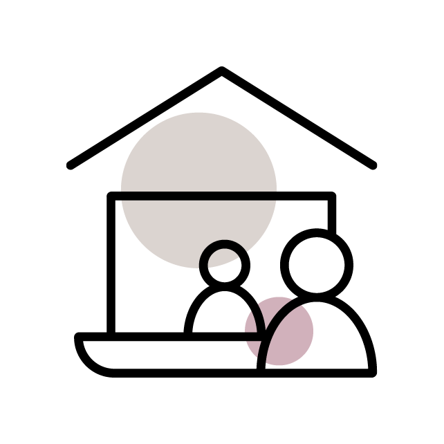
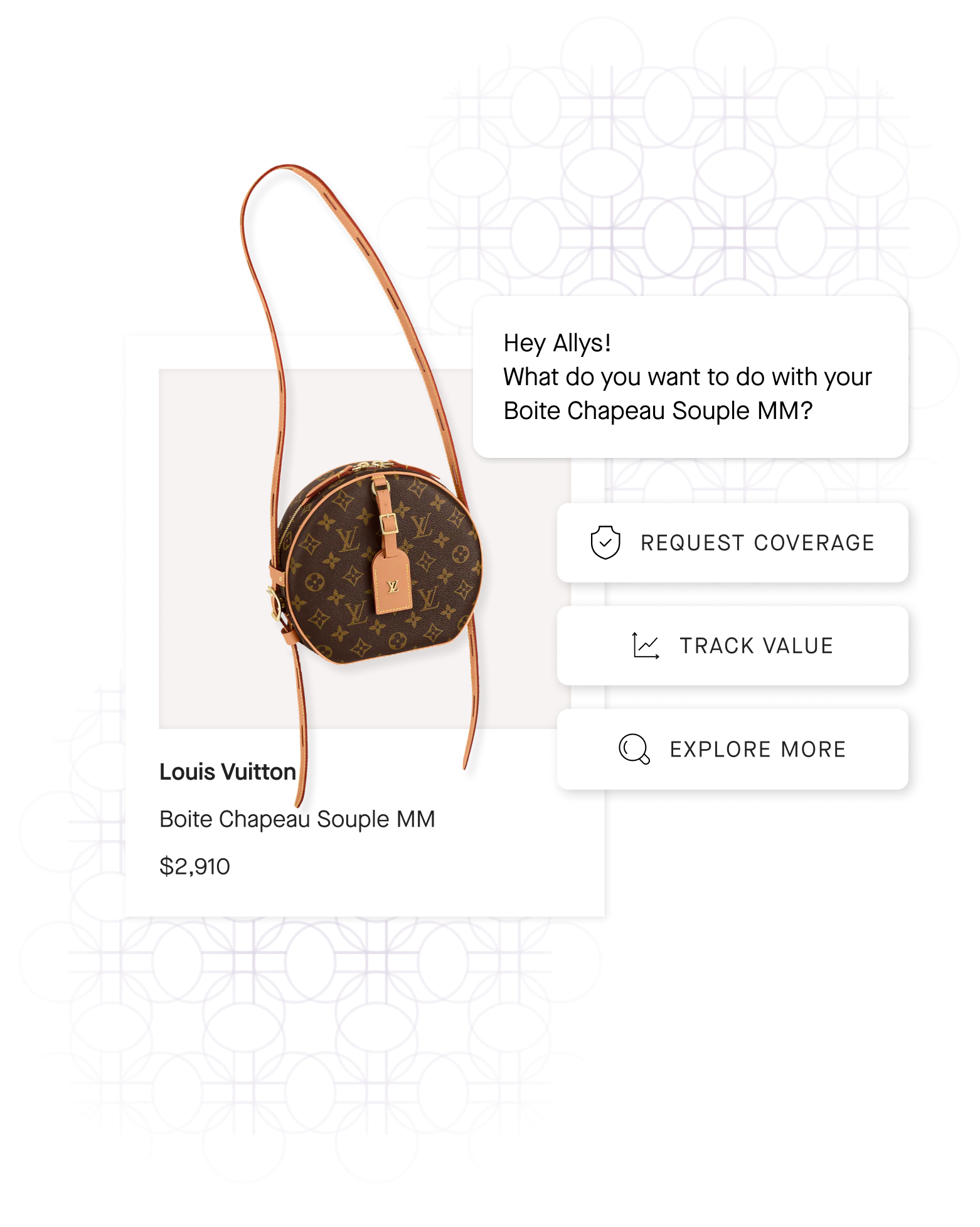
Coverage Landing Page
︎︎Coverage landing page follows the website’s overall brand with a slight changes in the layout, order, and the feature section. All landing pages use the Feeling Confident color pairs.

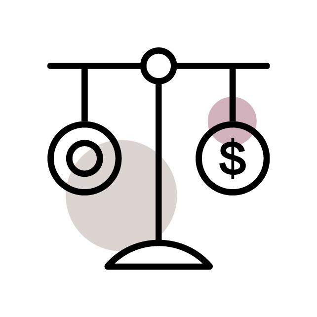
Collector’s Guide
︎︎We developed a comprehensive database for luxury brands, which features dedicated pages for each brand. These pages contain detailed information about the brand's history, product offerings, and other interesting facts, serving as a valuable reference for luxury enthusiasts.


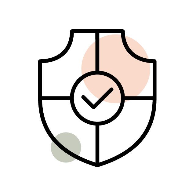
Press Landing Page
︎︎

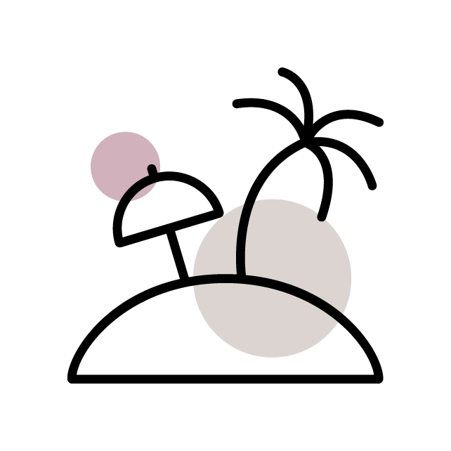
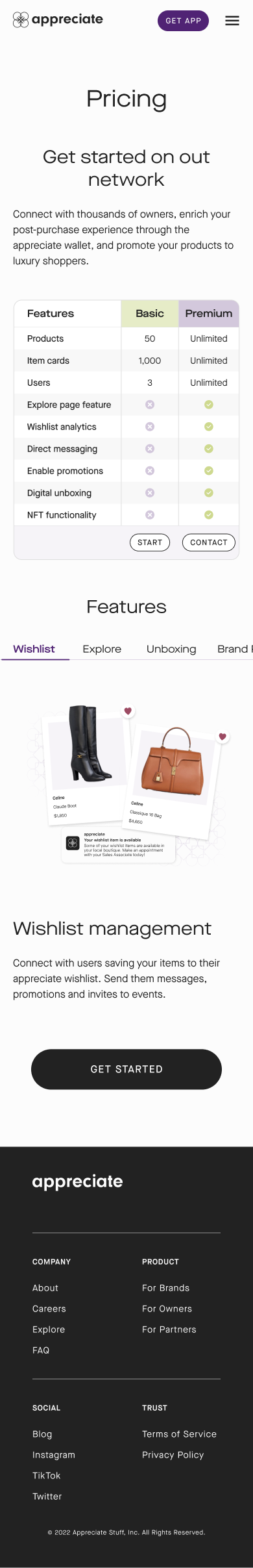
Pricing Landing Page
︎︎This page serves as a pricing reference for both current and prospective clients.
![]()
![]()
![To enhance the user experience, we implemented a new horizontal tab scrolling style.]()
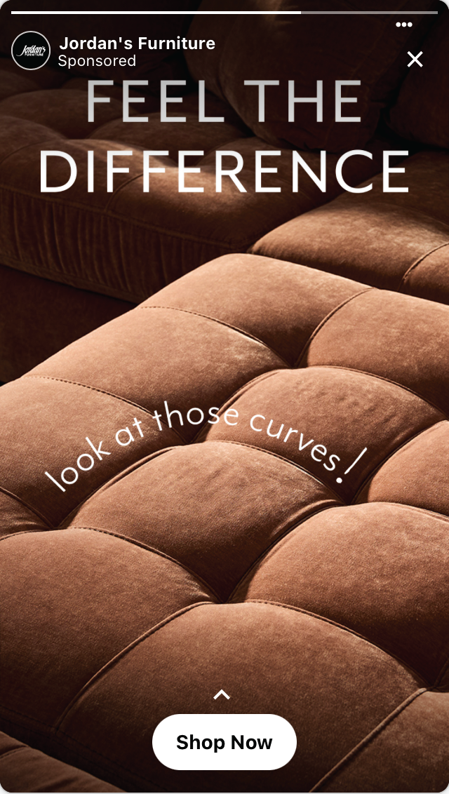
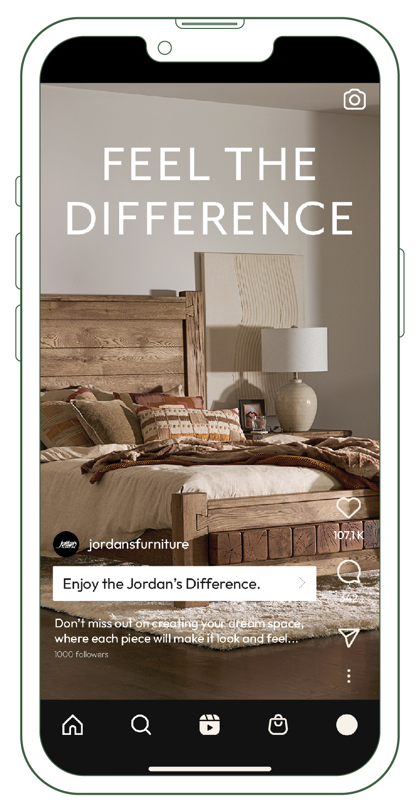
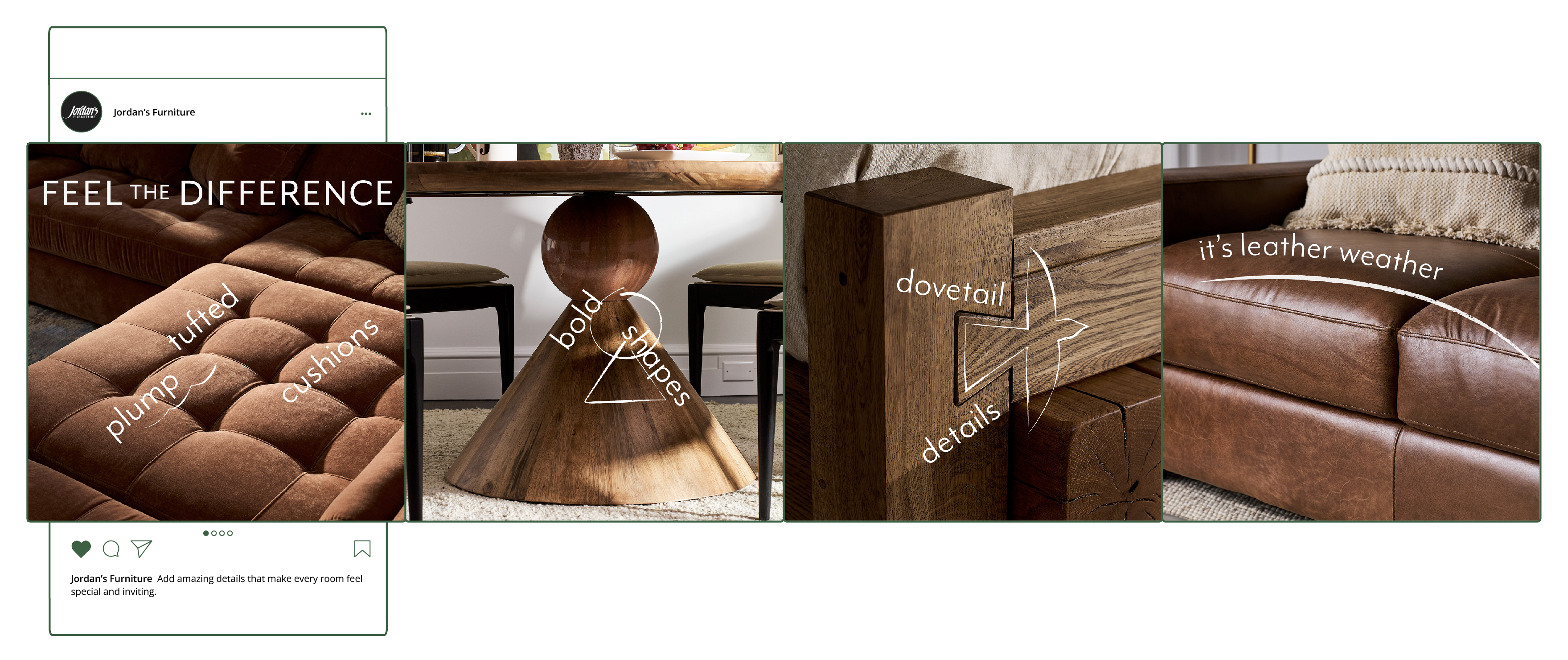
Feel the Difference Campaign
Jordan’s Furniture

Centered on textures, the campaign evoked warmth, comfort, and luxury, targeting adults 25-54. The key message, “Feel the Difference,” emphasized the quality and variety of materials, from rich woods and warm leathers to plush seating and cozy beds. The tone also balanced inspiration with the brand’s signature playfulness.
Credit for this project goes to the entire creative team at Jordan’s.
Lockups & Colors
︎︎We used Jordan’s brand typeface, Mr. Eaves, for the lockups and selected elegant, seasonal colors as the primary palette to elevate the campaign’s message.

Photography & Video
︎︎We planned to shoot 10 different room scenes for the campaign with selected merchandise, along with additional footage for TV ads and marketing assets.
Web Pages
︎︎The web pages were designed to reflect the campaign’s focus on textures, incorporating the illustration style, type treatment, and bold imagery to highlight the curated room scenes and merchandise.

Emails
︎︎Emails supported the main merchandise stories for the campaign.
Social Ads
︎︎For social media, we followed key marketing principles—awareness, traffic, and conversion—to guide our strategy. We created tailored assets for platforms such as Meta, YouTube, and Pinterest, ensuring each piece aligned with the campaign's goals and resonated with platform-specific audiences.
Awareness
Meta Consideration


In-Store Displays
︎︎Display Banner Ads
︎︎Banner ads were created in five different sizes to further promote the campaign across various online platforms.

L Bar & Game Flow
︎︎Using different elements that aligned with the campaign’s overall cohesive visual identity, Lbar and game flows were integrated into different sports game screens.

Rentlist
Branding
Web Design
UI/UX Design
Prototyping
Rentlist is an apartment finder website I designed during my time at Designlab. It allows users to search for apartments in specific areas and filter results based on defined criteria. I prioritized user needs throughout the design process, resulting in a visually appealing and intuitive interface for a streamlined apartment search experience.
Task Flow
This task flow outlines how a user can search for an apartment in a specific area, refine results based on criteria, view details about an apartment, and contact the owner. The entire project was focused on streamlining this process and prioritizing user needs.


Logo
I chose the name Rentlist after some research and brainstorming. For the logomark, I combined the letters R and L with an abstract shape of an apartment. I chose Lato, a modern sans serif type for the logotype, and developed a color palette later in the project.
Icons
To ensure a consistent design system, I created custom icons that complement the logomark. They feature a single color and stroke for a cohesive look.
Style Tile
I created a style guide that includes the colors, typefaces, imagery, buttons, and icons to be used. This guide serves as a reference for maintaining consistency and creating a cohesive design for the website.


Wireframes
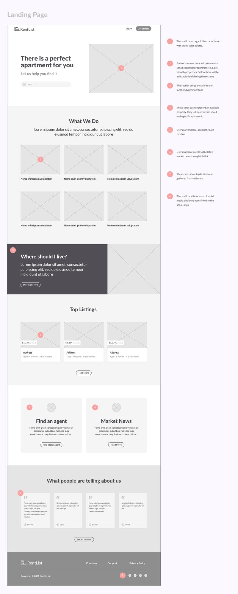
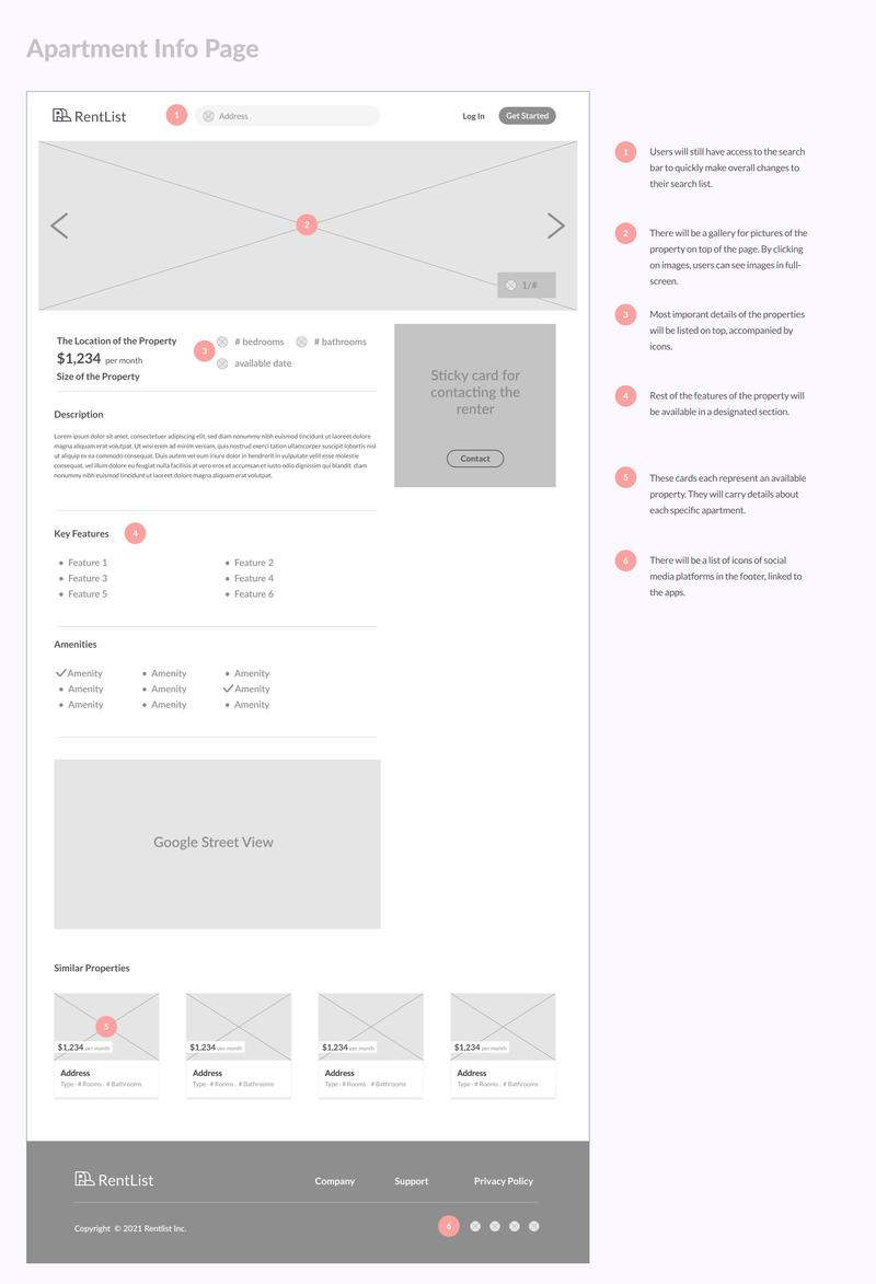
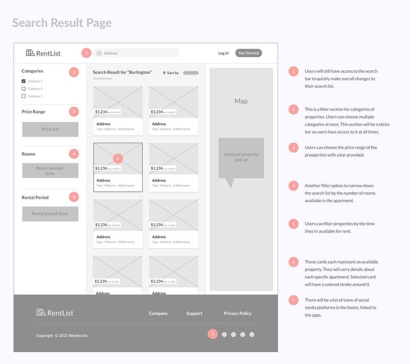
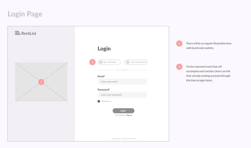
When designing the wireframes, I focused on defining the content, structure, and layout of the core screens in the website's primary user path. Additional information for each screen is provided on the right side for a more comprehensive understanding.

High-Fidelity Desktop Mockups
Based on the refined wireframes, I designed hi-fi mockups using Figma. Below you can see the five main pages that are based on the initial task flow.
1. Landing page
![]()
2. Login page

3. Search result page
![]()

4. Apartment page
![]()

5. Contact page
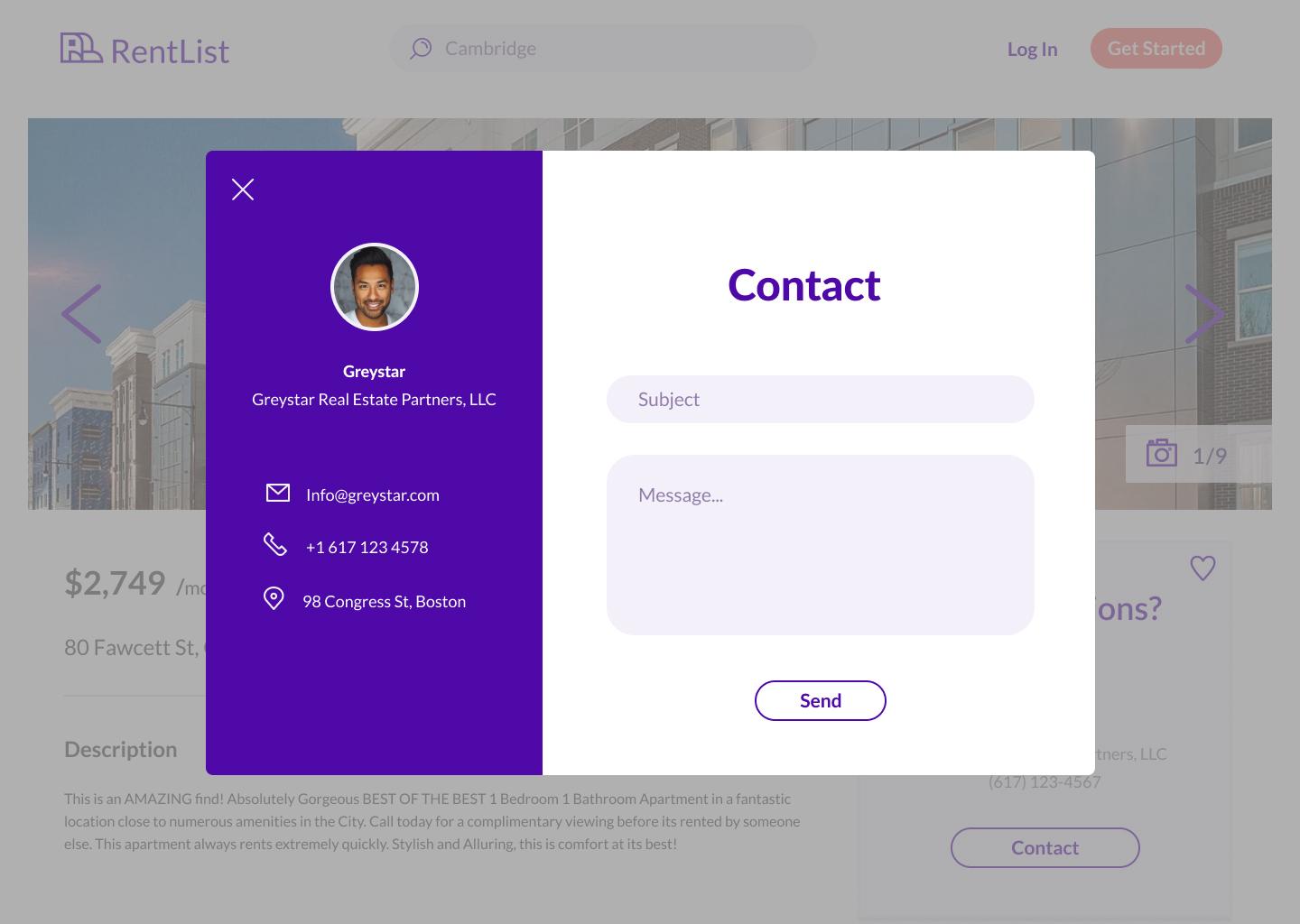
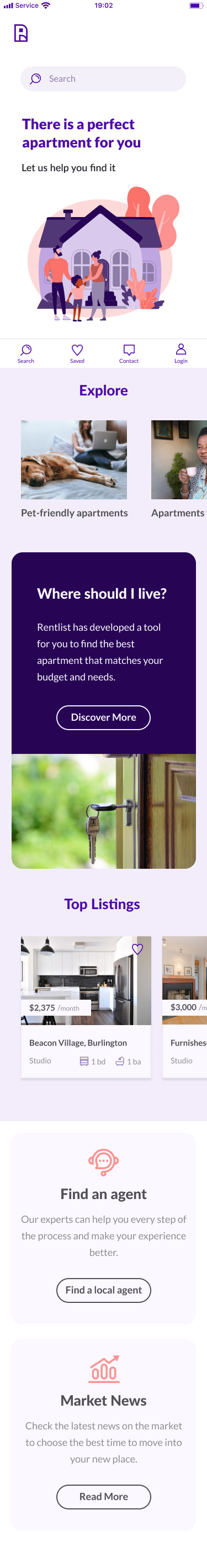
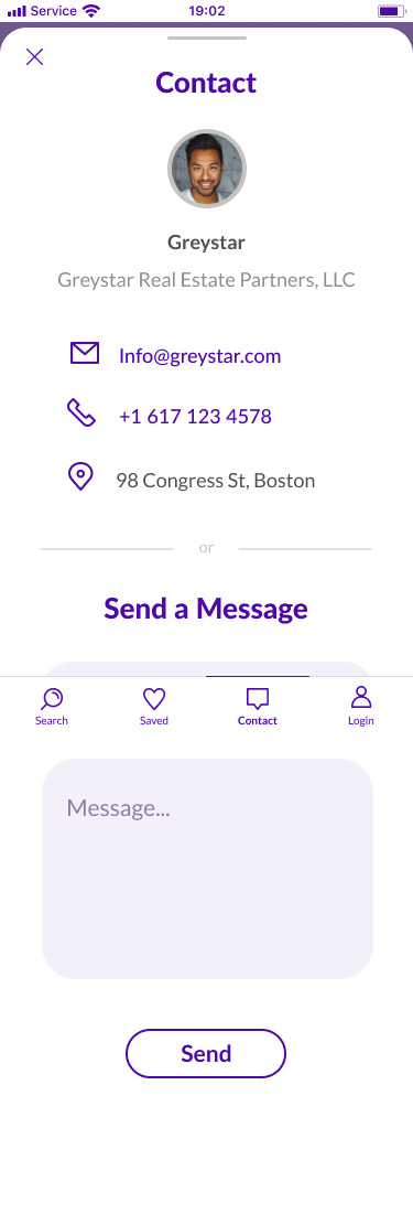
High-Fidelity Mobile Mockups
I incorporated responsive design principles into my work by creating a mobile version of the desktop mockups. I adjusted layouts, content, and design elements to ensure optimal user experience across different devices.


Prototypes
The prototypes below allow you to experience firsthand how Rentlist's website and mobile app can be used to complete the apartment renting task.
If you want to see more of my web design work you can check out these project ︎︎︎