
Rebranding Project
During the rebranding project for Appreciate, we realized that the existing brand did not accurately represent the company's values and mission. Thus, we initiated a complete overhaul to better align the brand with the company's objectives. To guide our efforts, we asked ourselves critical questions about Appreciate's purpose, perception, and positioning in the luxury goods industry within the Web3 space.
Process
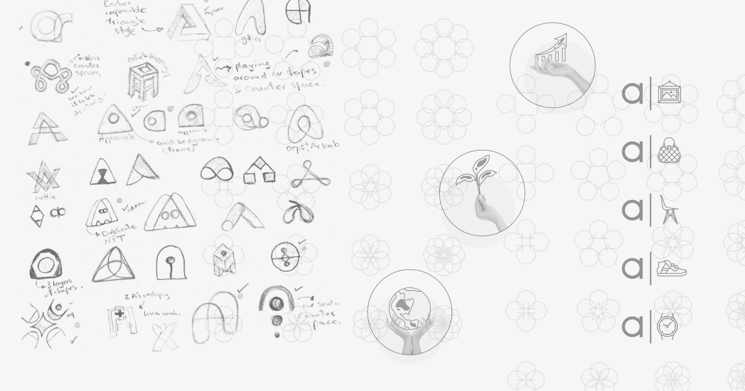
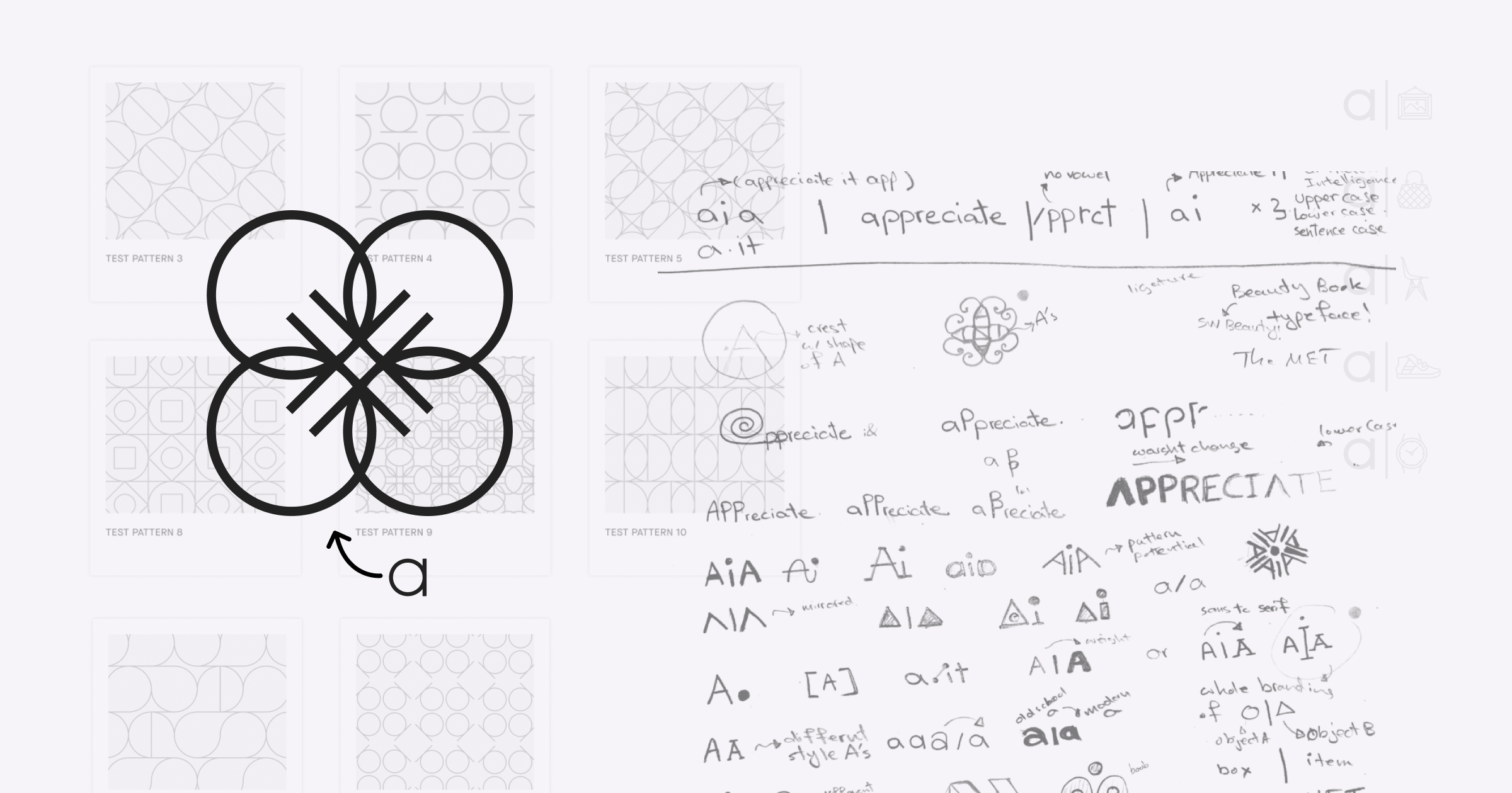
︎︎We approached the rebranding process with a comprehensive design process, beginning with ideation and conceptualization, followed by several rounds of brainstorming, sketching, and multiple iterations, and culminating in the production of various assets for the new brand. We understood that Appreciate required a brand that effectively communicated its values and mission. As such, we focused on creating a brand that would accurately represent what Appreciate does and stands for. The rebranding process was a collaborative effort across the entire design team at Appreciate, resulting in a truly remarkable outcome.


Logo
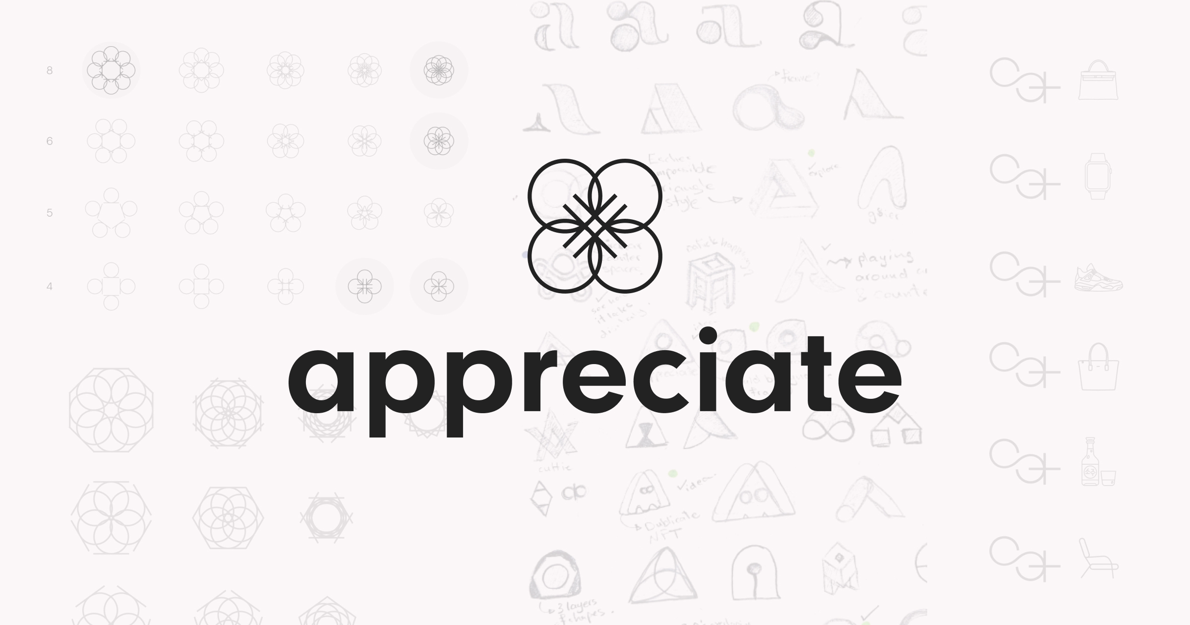
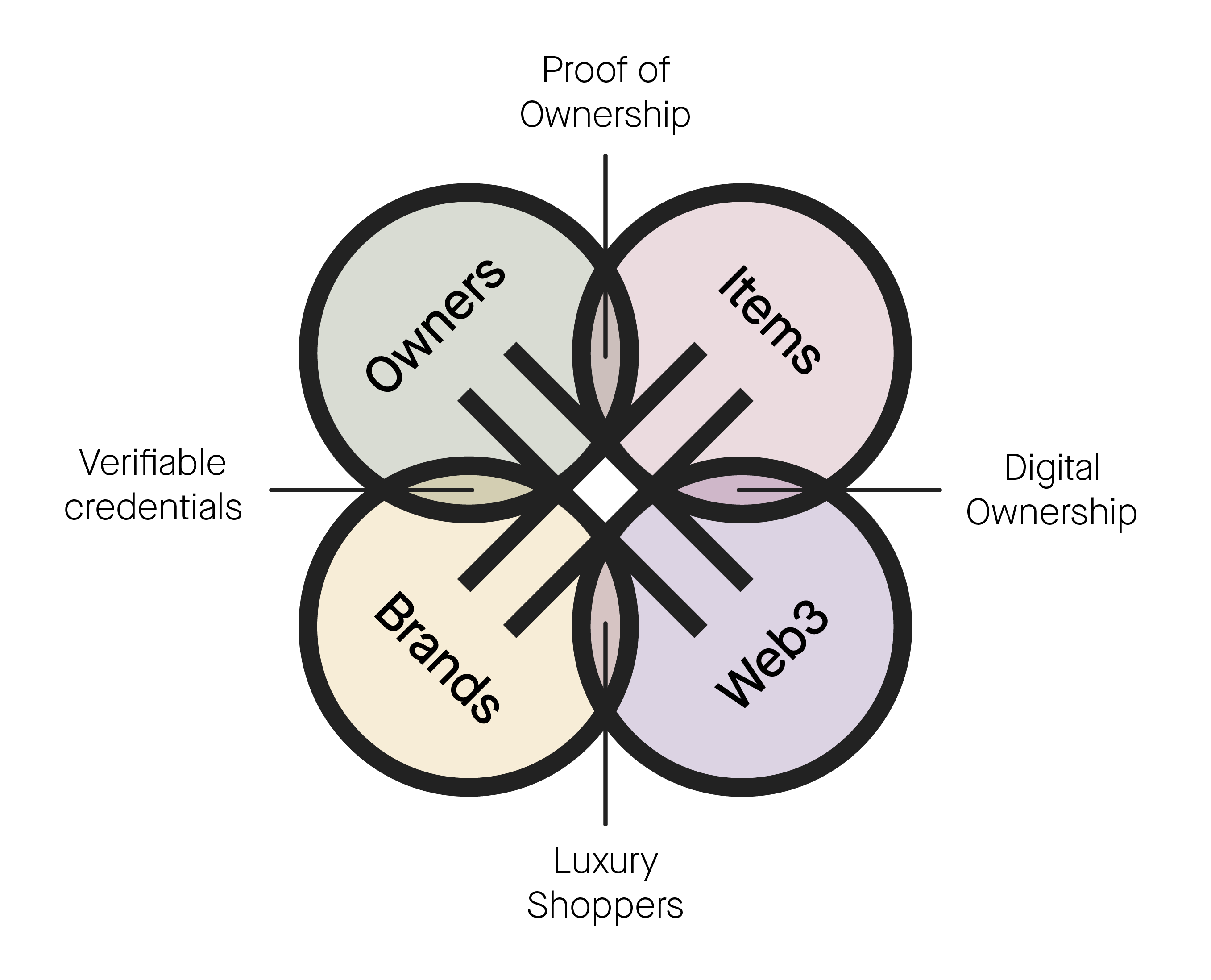
︎︎The number four holds a special significance in the new appreciate brand. The new logo features a clover made up of four intertwined a's, symbolizing the role of the appreciate platform in connecting brands, partners, owners, and luxury items.
Vertical and Horizontal Lockup
![]()
![]()
Light and Dark Backgrounds
![]()
![]()


Light and Dark Backgrounds
Type
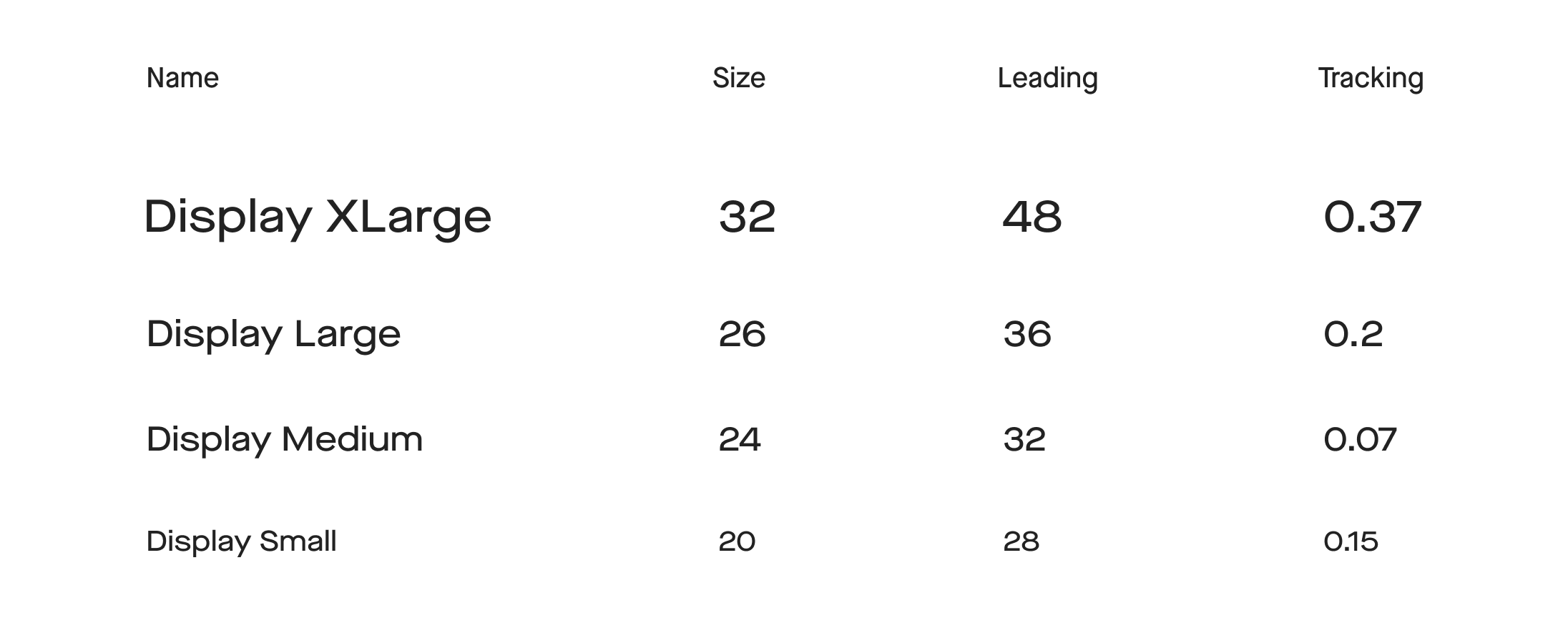
︎︎To fit with the tech-focused aesthetic of appreciate, we sought out a clean and modern sans serif font with a touch of character. After exploring various options, we selected Maison Neue as our typeface of choice. This versatile font works exceptionally well in the digital space and adds a unique touch to the overall brand identity.
Type System
![]()
![]()
![Thank you Rob for our Kestrel System]()
![]()


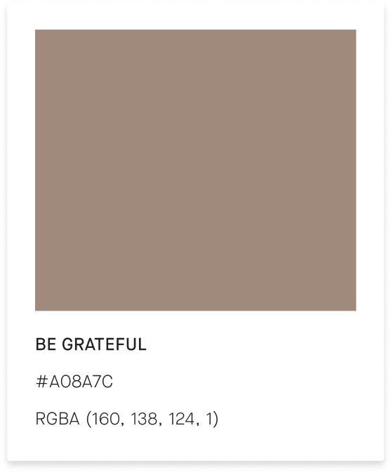
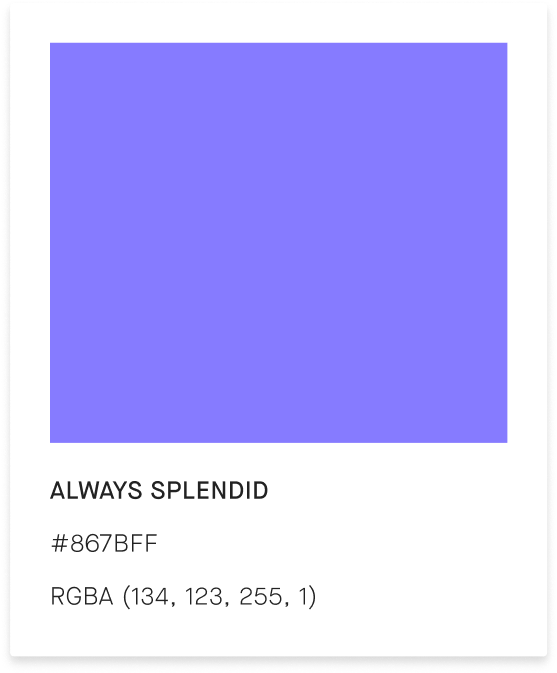
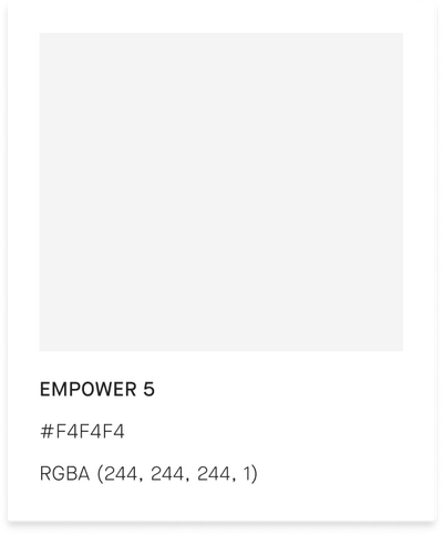
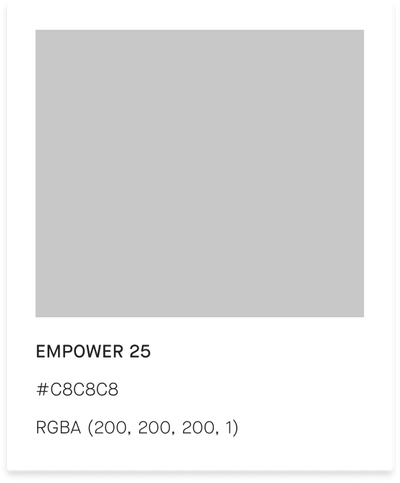
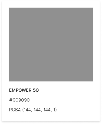
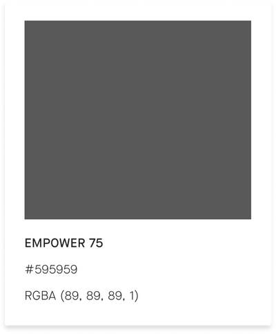
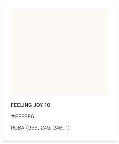
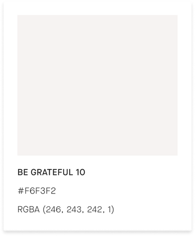
Color Palette
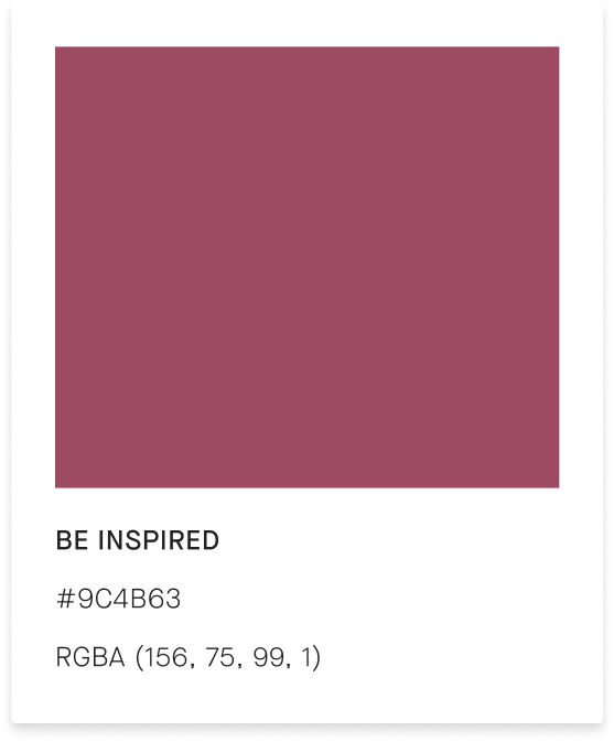
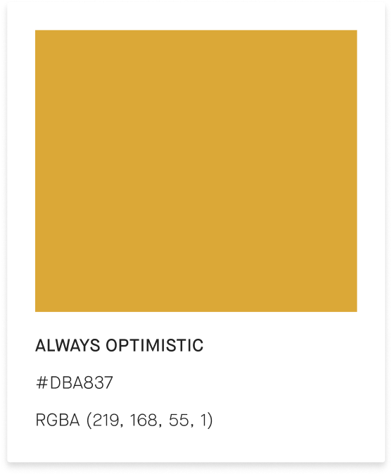
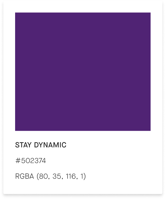
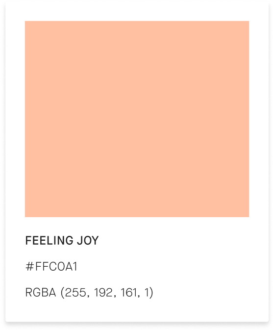
︎︎To adhere to the rule of fours, we selected four primary colors and four respective accent colors for each. The gem colors were chosen to represent the luxury space while also grounding the user. We also incorporated softer, brighter colors to complement the gem colors, illustrating how the brand is dynamic and serves as the intersection between luxury and fashion worlds.
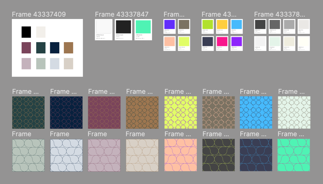
Foundation Colors
Primary Colors
Accent Colors

Tertiary Colors

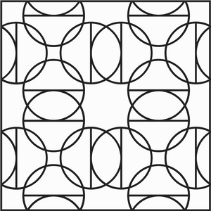
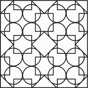
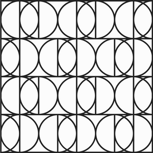
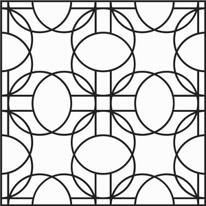
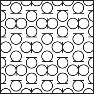
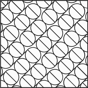
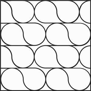
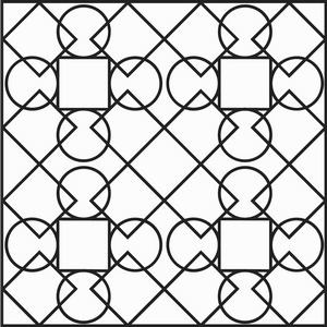
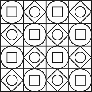
Patterns
︎︎To enhance the visual identity of appreciate, we developed a pattern system using geometric shapes that resemble the logo mark. Our aim was to elevate ownership by empowering owners to make informed decisions about their belongings and find new utility in their existing items. Additionally, incorporating sophisticated patterns into the brand design ties back to luxury brands and their symbolic pattern systems, further reinforcing appreciate's position in the luxury fashion industry.