
The Empathy Project
Branding
Web Design
Interactive Design
Publication Design


The empathy kit was created to symbolize empathy and provide people with an opportunity to understand other people's experiences of inequalities by putting themselves in their shoes. The kit includes real empathy stories from people who have experienced inequality based on nationality, race, sexuality, gender, disability, and body image. The goal of the project was to connect people and encourage them to share their own stories.
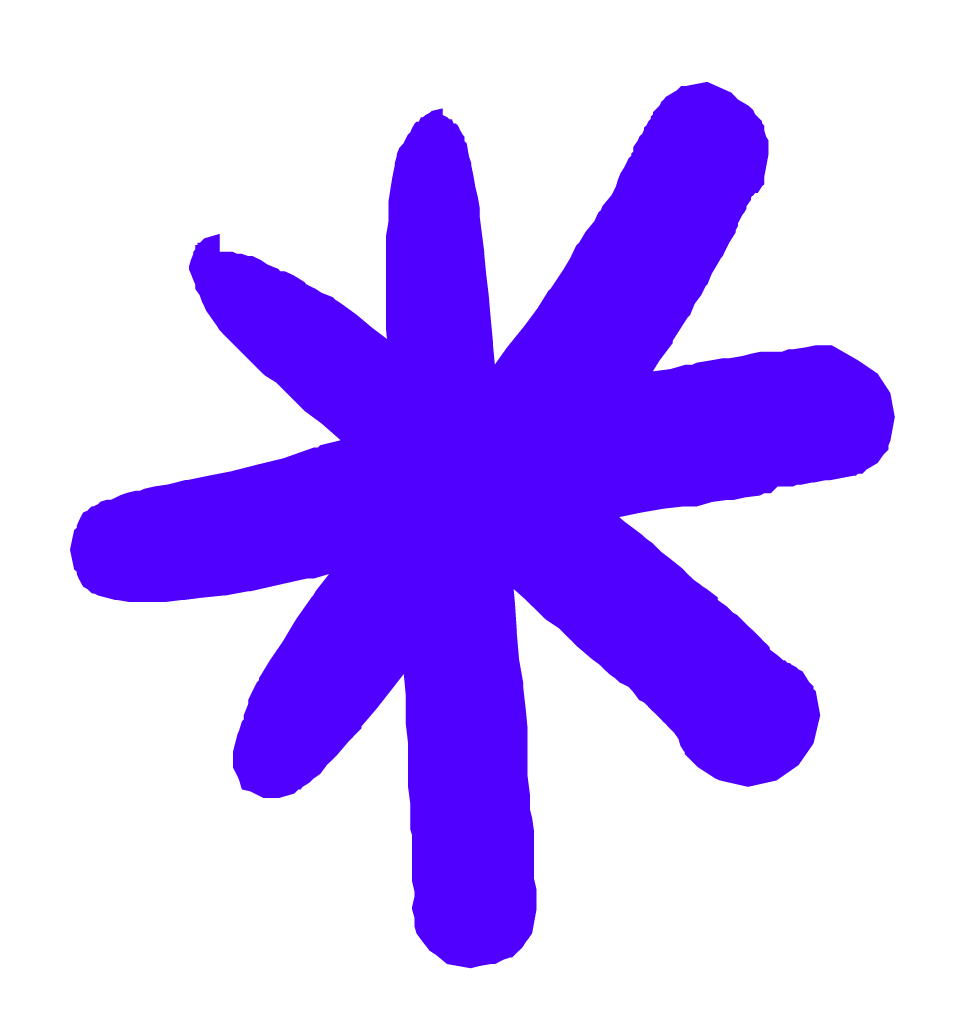
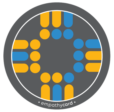
The empathy logomark has different levels of meaning. At first glance, four figures holding hands represent connection and empathy, emphasized by chains tying them together. On a lower level, four heart-shaped forms are linked together. Opposite colors (blue vs. red, dark vs. light) are used, and the circles symbolizing the heads of the figures are swapped to show the sharing of thoughts and feelings.

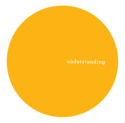
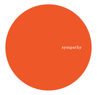
When working on the logo mark, the creator chose CMYK colors to indicate diversity in people and stories. These colors can be mixed to create any type of color, representing any kind of person and their personal stories. The intention was to show the range of possibilities and diversity that can be represented with just four basic colors.


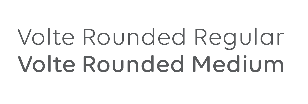
I chose Volte Rounded as the primary brand typeface to give the brand a modern look while maintaining a friendly intent. Archer was chosen as the secondary typeface for its well-designed slab serif, creating a striking contrast with Volte Rounded, and highlighting the circular forms present throughout the brand.


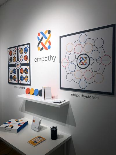
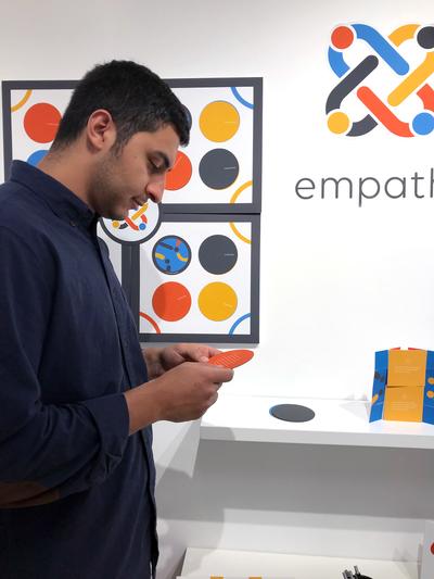
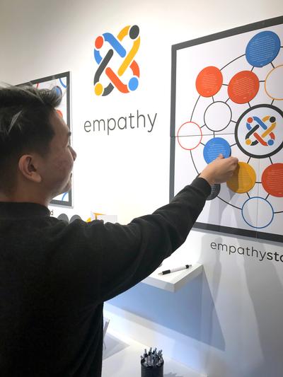
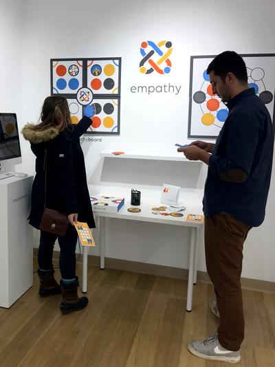
The empathy boards were the primary interactive components of the empathy project, consisting of large-scale magnet boards that allowed for greater impact and visibility of the stories.


More stories:


The empathy story pieces were made from magnets so that they could stand on the boards on the wall. The top of each piece was designed with the brand's visual elements, while the stories were on the backside. To reveal the stories, the audience could simply flip the piece on the board.


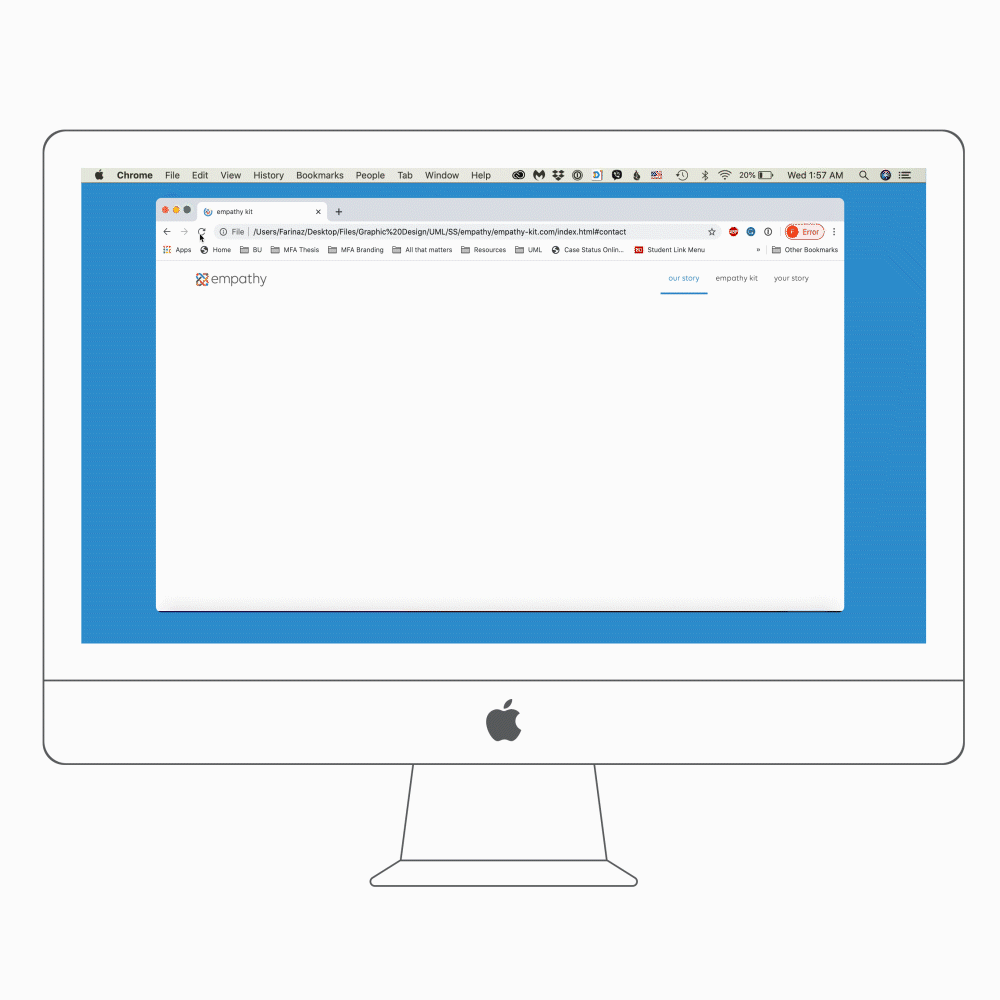
I built a responsive website from scratch to promote the empathy kit and provide an additional platform for collecting stories.
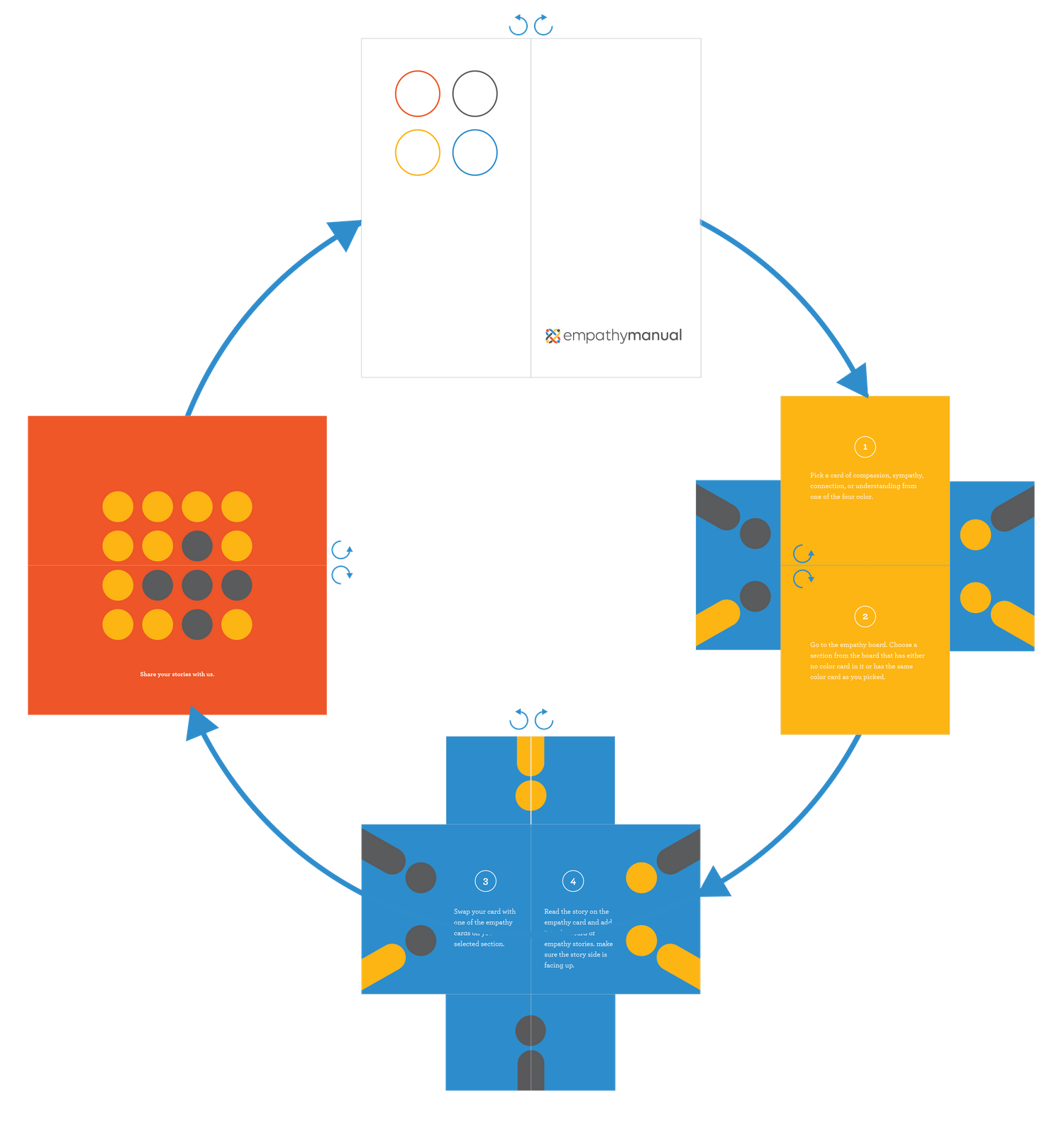
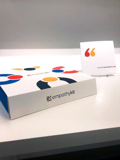
The empathy kit was a crucial part of the empathy project and required fitting all the components into a small package. I came up with a four-layer design that arranged the kit components in order of their size and use, with a magnet clasp for opening and closing the package. A manual was also designed to explain how to interact with the empathy boards, featuring a unique looping structure that allowed for smooth navigation.


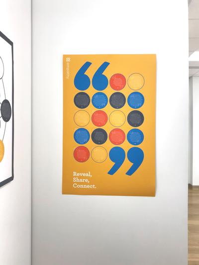
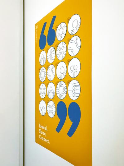
To align with the project's overall theme, I made the poster interactive as well, allowing the audience to connect with the stories. Circular elements on the poster were perforated and could be peeled off, gradually revealing the stories as the top layer was removed by the audience.


The final installation of the empathy project was displayed at the University Gallery at Umass Lowell for two weeks, during which visitors interacted with the installation, revealed the empathy stories, and shared their own personal stories.


To read more about the process of this project look at this process book.